Design
Systems
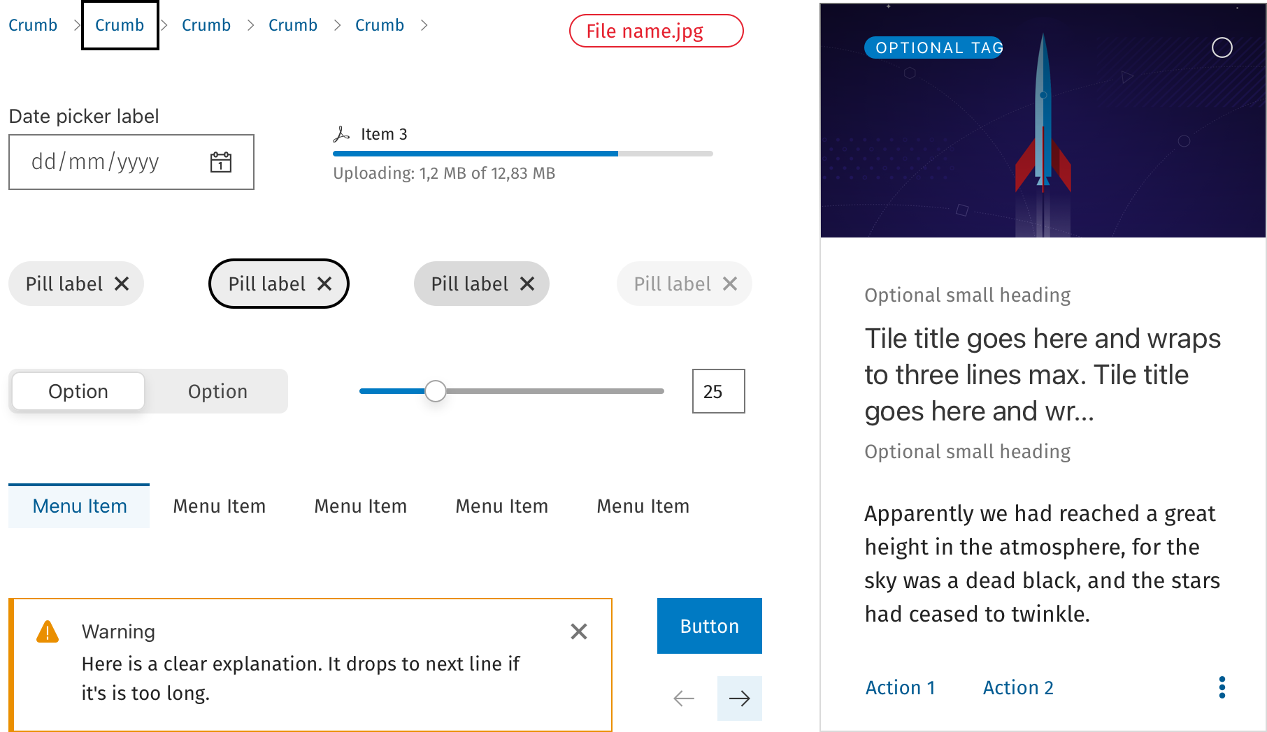
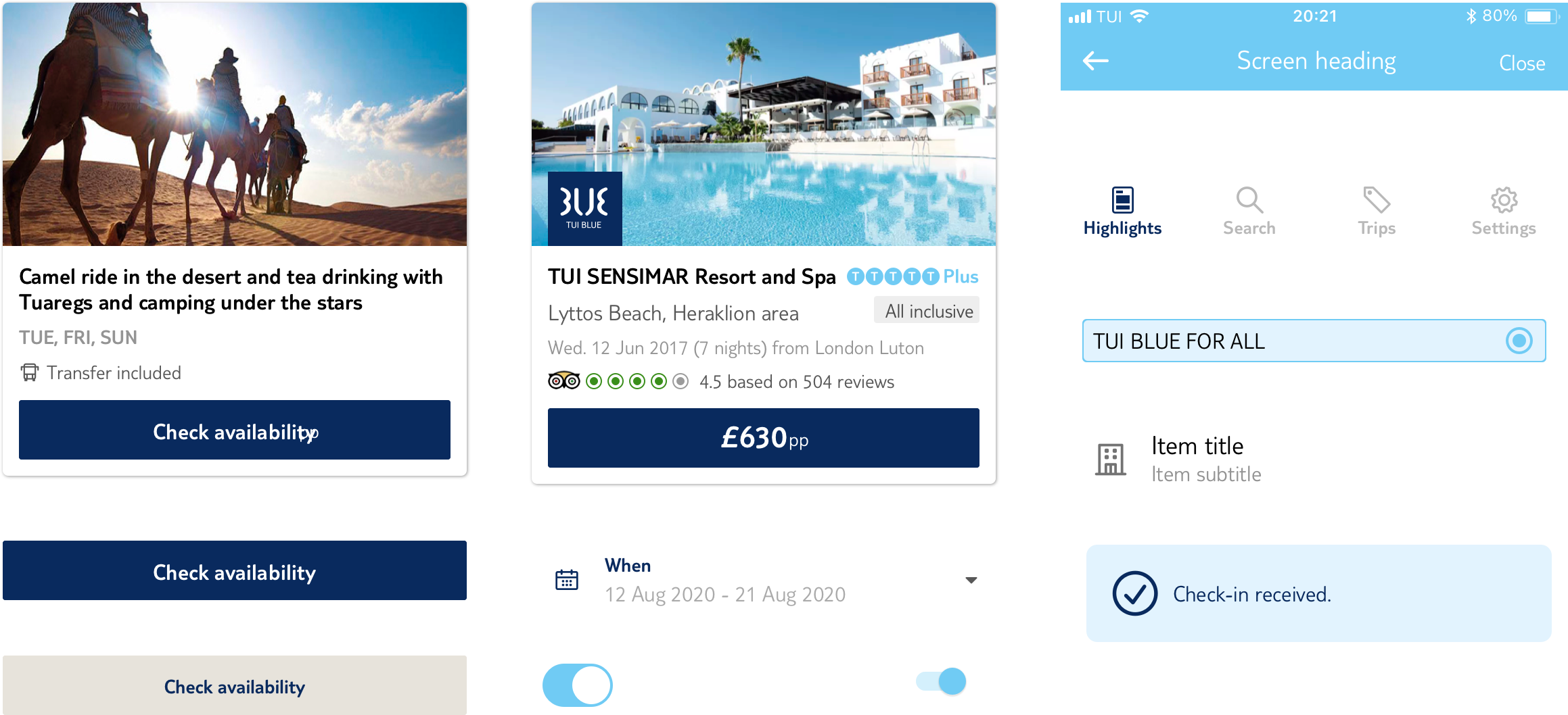
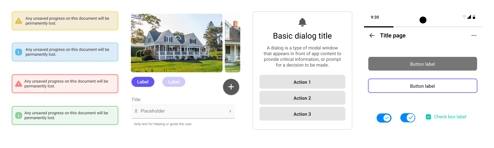
Four design systems across four companies — built from scratch, inherited and evolved, audited and documented. A running thread through almost every role I've held.
The icon system was built entirely through Sketch, store in Abstract andqwe also used Adobe Ilustrator and IcoMoon — converting SVG icons into a custom web font so they could be used as characters across the product. This was the standard approach before SVG icon systems became mainstream, and it required careful naming conventions, fallback planning, and close coordination with development.
Alongside the icon work, I created and maintained the full component library: buttons, inputs, navigation patterns, cards, modals, and data display components. Adobe Illustrator was used for icons and illustrations that Sketch couldn't produce cleanly at the time.
It was an inherited system — every component defined by previous designers. I've had to update an existing kit to be inclusive of Wolters-Kluwer Design system
Custom icon library compiled as a web font using IcoMoon — icon naming, mapping, and maintenance all owned by design.
System split into two Sketch branches due to file weight.
Adobe Illustrator used for illustrations and detailed UI elements that required vector precision beyond Sketch's capabilities.

Started as a shared Sketch UI kit built collaboratively with two other designers. We audited every existing flow to identify missing, inconsistent, or outdated components — cataloguing what existed before defining what should. The kit standardised buttons, form elements, navigation, cards, and key interaction patterns across the app.
I led the migration from Sketch to Figma — redesigning and restructuring the component library in the process. Added full documentation for every component: usage guidelines, dos and don'ts, spacing rules, and variant definitions. Built a zero-height presentation page demonstrating to product and engineering how a properly maintained design system could accelerate development — a pitch that, at the time, didn't land with the weight it deserved. A smaller, stripped-back version was also produced for the First Choice brand.
When TUI committed to a company-wide brand refresh — simplified colour palette, new typography scale, updated weights — I rebuilt the system a third time to match. This wasn't a reskin: the simpler visual language required rethinking component hierarchy, reworking spacing tokens, and re-auditing the component set for relevance in the new direction.
The process started with a comprehensive audit: I went through every existing flow in both products to catalogue all components — identifying what was missing, what was inconsistent, and what had been built ad hoc without a system in mind. This audit formed the foundation of the component prioritisation list.
From there I built the system: defining tokens, creating base components, documenting usage rules, and building out the variant structures in Figma. I also acted as the ongoing tester — checking components against real product screens to catch edge cases and misalignments before they reached production.
Designed all components from scratch — tokens, base elements, composite components, and layout patterns.
Written usage guidelines, dos and don'ts, spacing specifications, and state descriptions for every component.
Reviewed every screen in both products to identify gaps, inconsistencies, and components not yet in the system.
Tested all components against live product flows — catching edge cases, overflow states, and implementation divergence.
Every component page in our library follows the same structure — going beyond the vectorised element and its variations to give designers and engineers the full picture: how it's built, how it behaves, and how to use it correctly.
A brief introduction to the component — what it is, where it lives in the product, and which elements it relates to or depends on.
A precise breakdown of every atom and molecule that composes the component — colours, tokens, classes, spacing, borders, backgrounds, and wrappers — documented to help engineers build it accurately.
Defines the behaviour of each variant within the component family and how they relate to one another in layout and priority.
Documents how the component responds to user interaction and system conditions — and the rationale behind each state's behaviour.
Covers how the component and its states are adapted for dark mode — including any exceptions or variations specific to that context.
Practical rules for correct use — how the component should be constructed, positioned, and combined with surrounding elements.
Traces the evolution of the component from its earliest form to the current version, using screenshots and legacy assets no longer in the active library.
A curated selection of external design systems included to broaden context and offer additional perspective on how this component is approached elsewhere.
Reviewed all three existing design systems — component coverage, documentation quality, token structure, and fit for dashboard use cases.
Identified which system had the strongest foundation for a new dashboard product — considering data density, layout flexibility, and long-form UI patterns.
For each of the three systems, identified the highest-value areas to extend, components missing for dashboard contexts, and elements from the other two worth absorbing.
Proposed a path for consolidating the strongest patterns from all three into a unified direction — reducing fragmentation without starting over.
The three systems each had distinct strengths — one was well-documented but narrow in scope, one had broader component coverage but minimal documentation, and the third had the most mature token structure. The recommendation favoured the one with the strongest token foundation, supplemented with specific dashboard components drawn from the others.