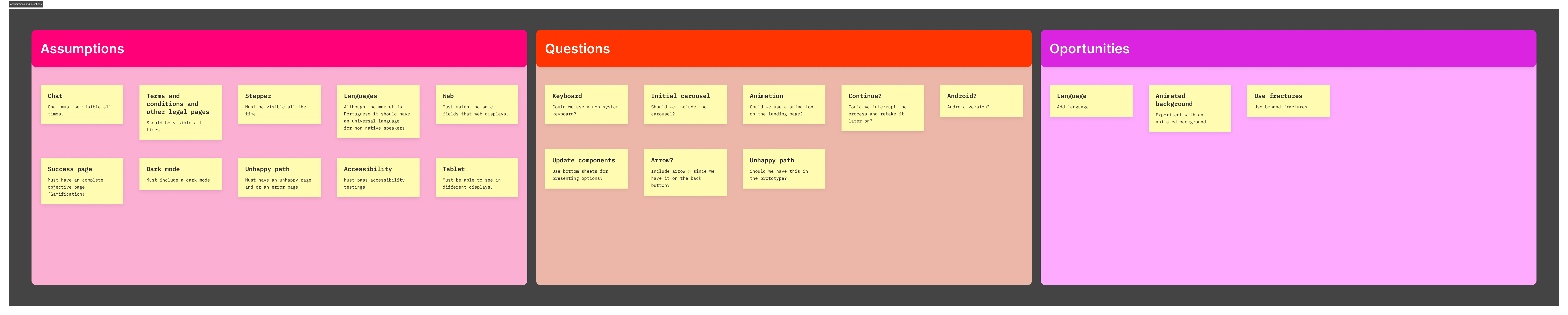
 UX board — Assumptions, Questions and Opportunities
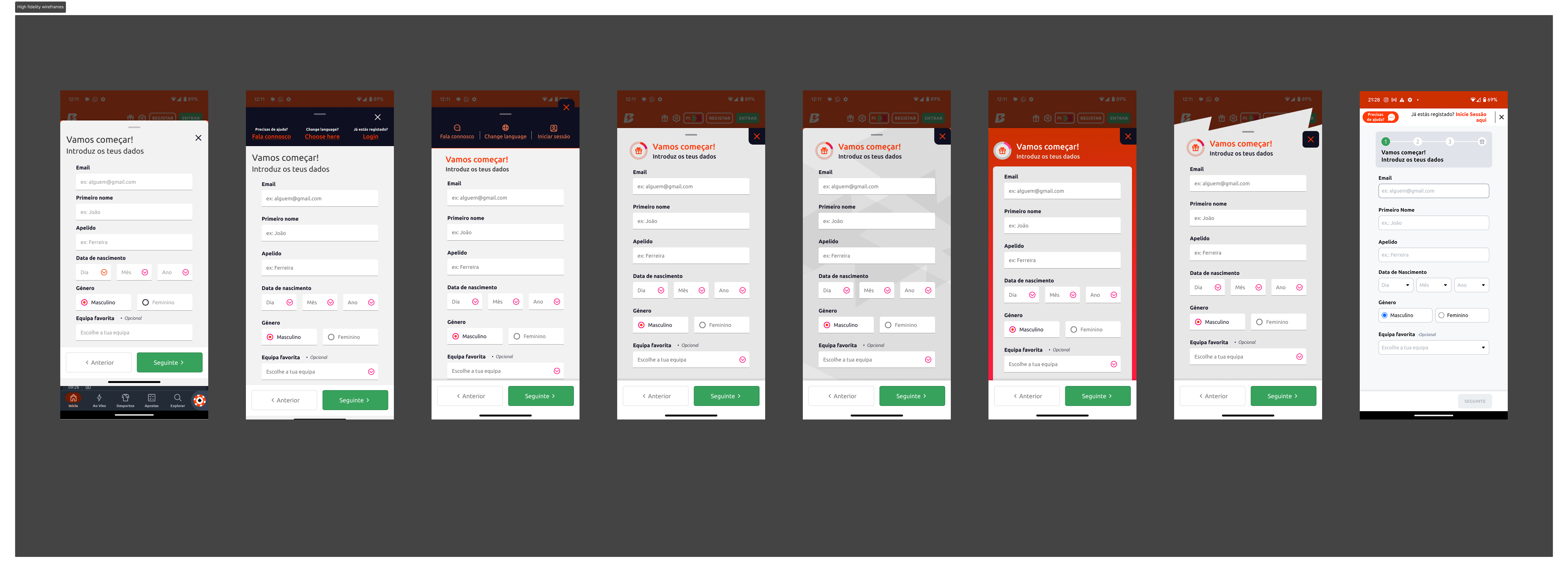
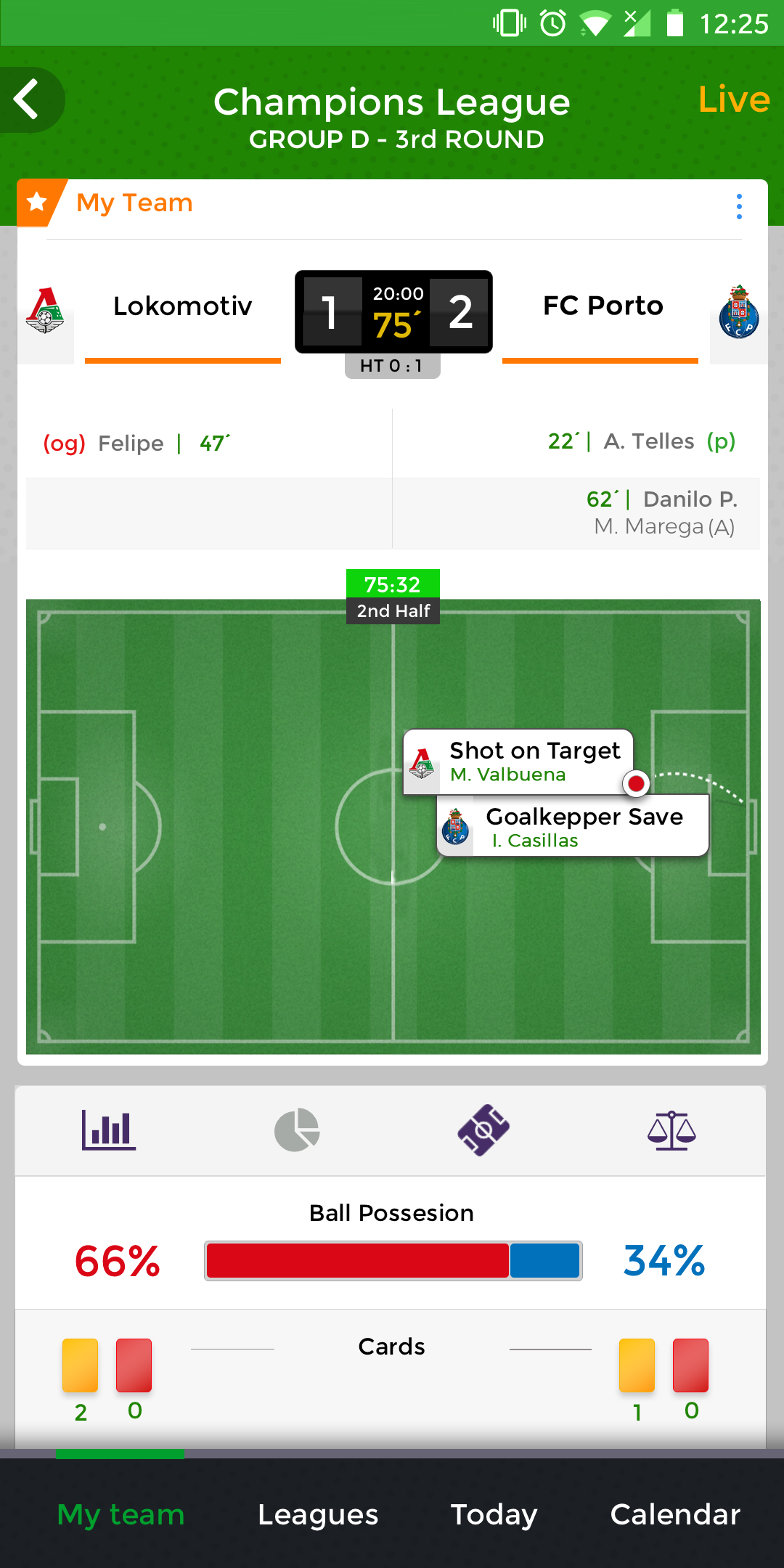
 High fidelity wireframes
 Final designs

A full onboarding redesign exercise for a (fictional) app product — covering user registration, identity verification, and first-value moment. Delivered as a Figma prototype with annotated decisions.
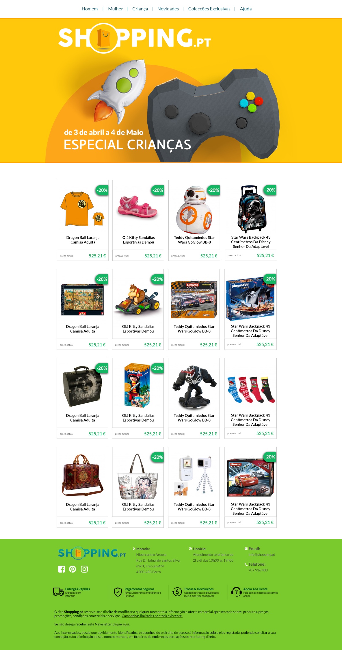
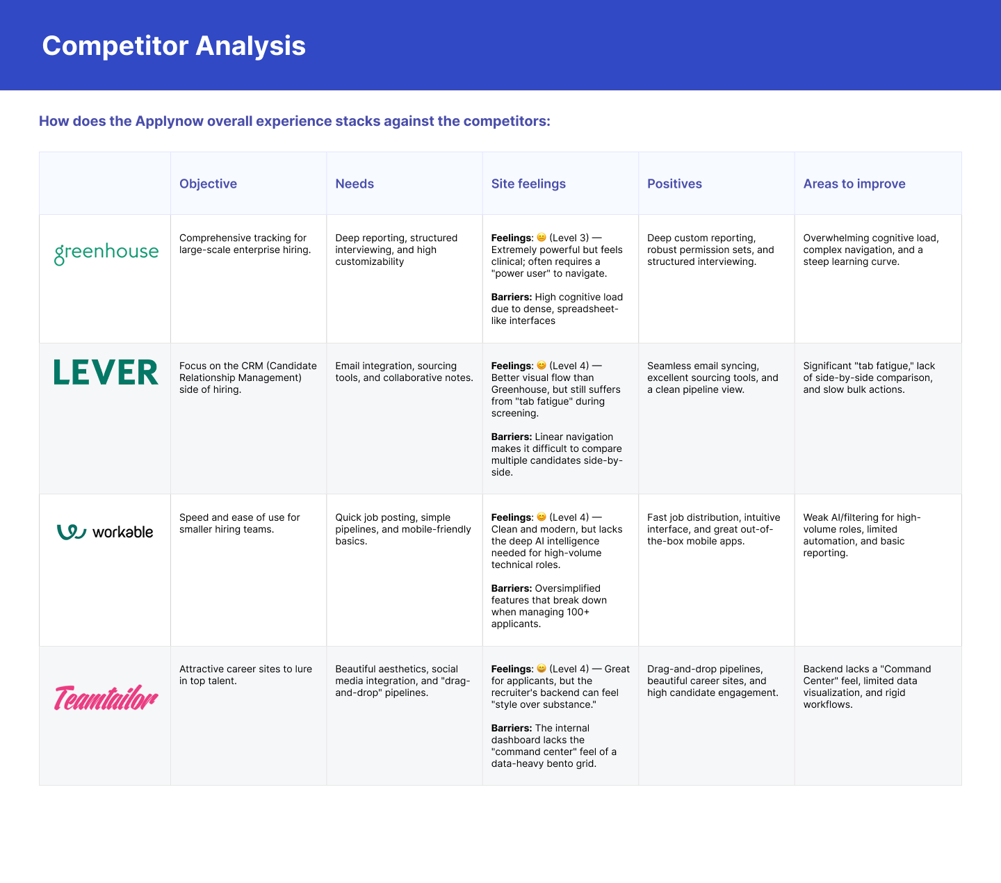 Competitor analysis
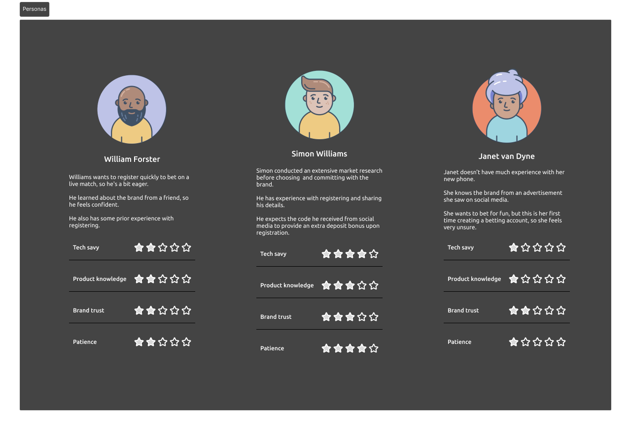
 User Journey
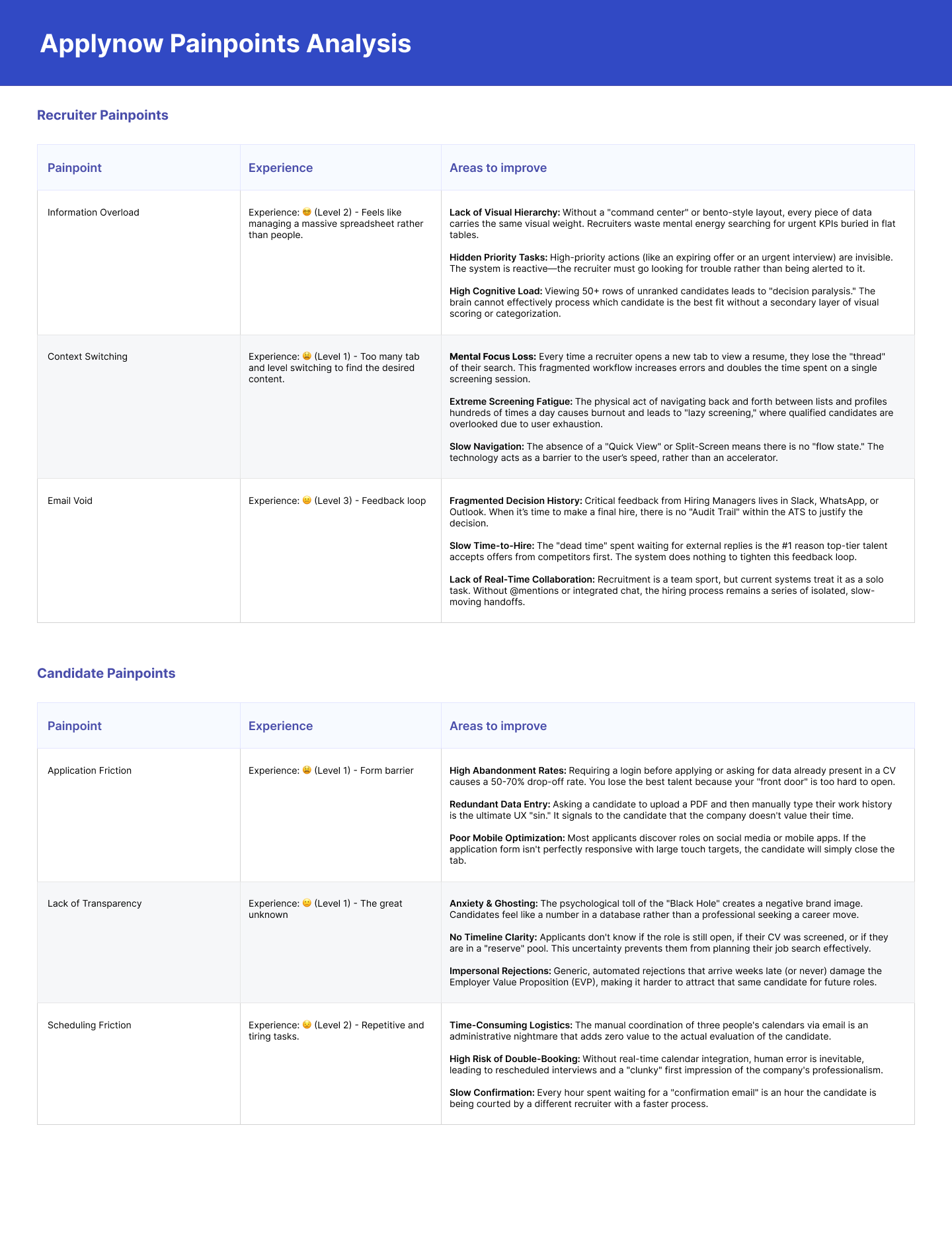 Pain points
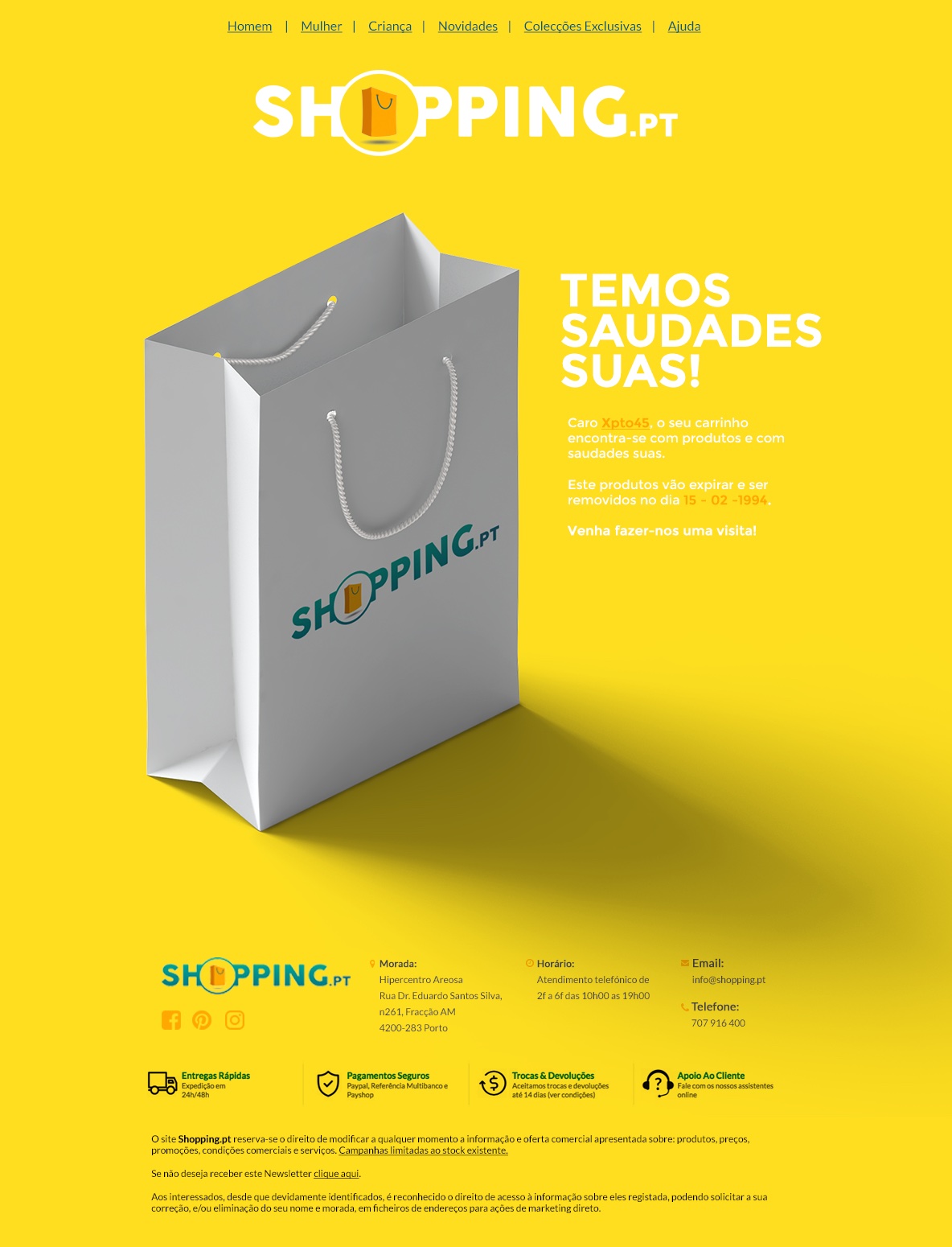
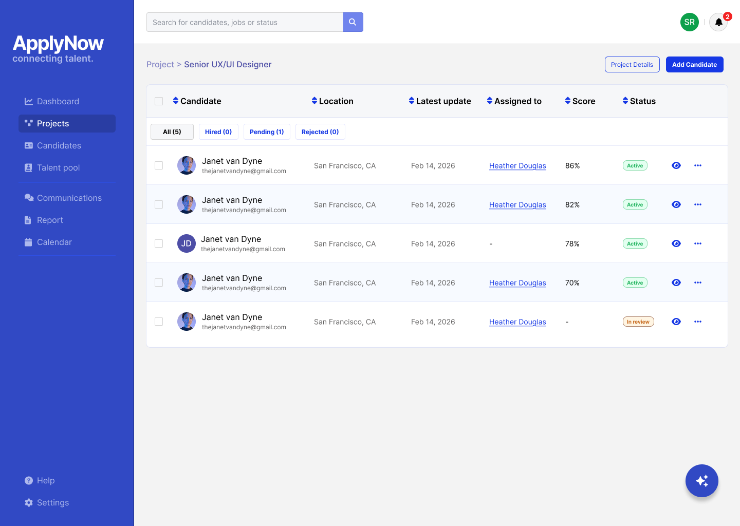 Final designs
Given a brief with a competitor service, the task was to propose a redesign within 48 hours. Focused on hierarchy, data density, and actionable insight.
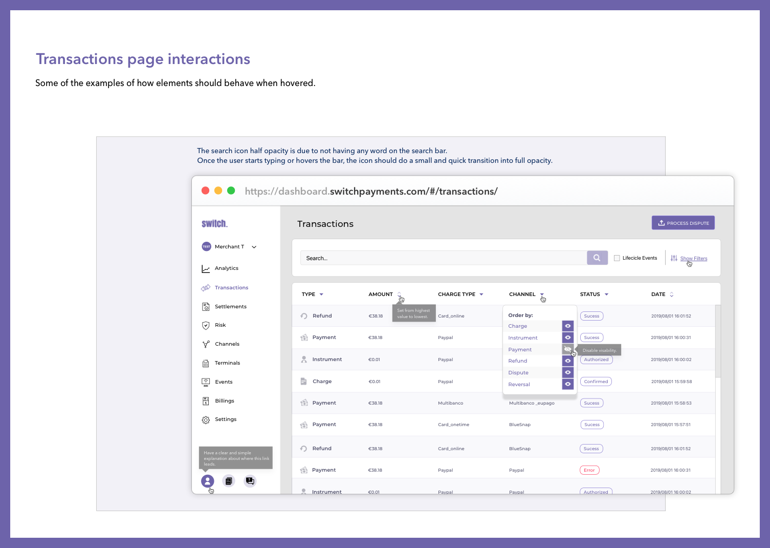 Interactions
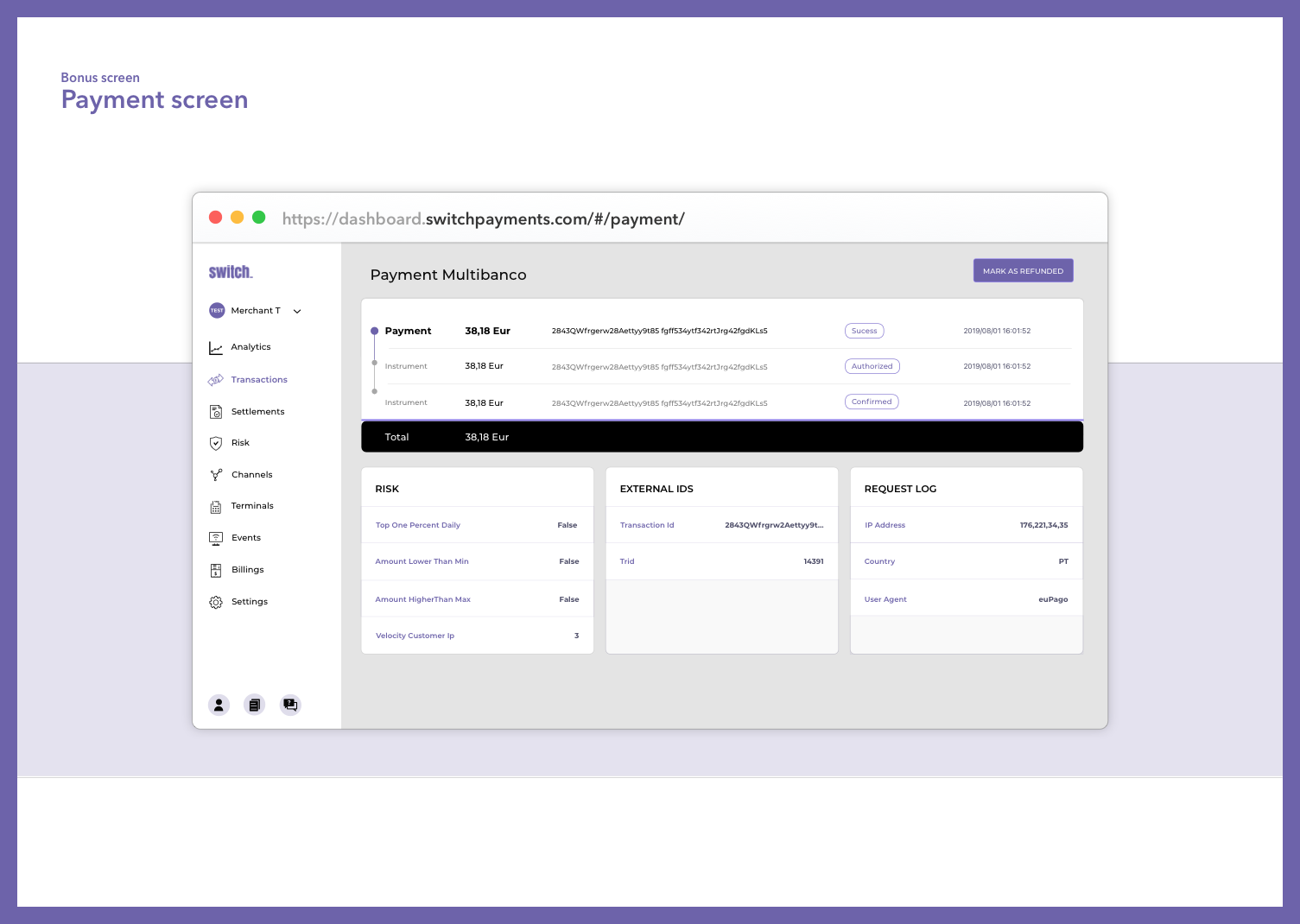 Payment screen
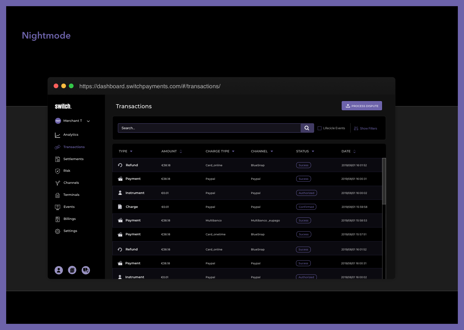 Dark mode
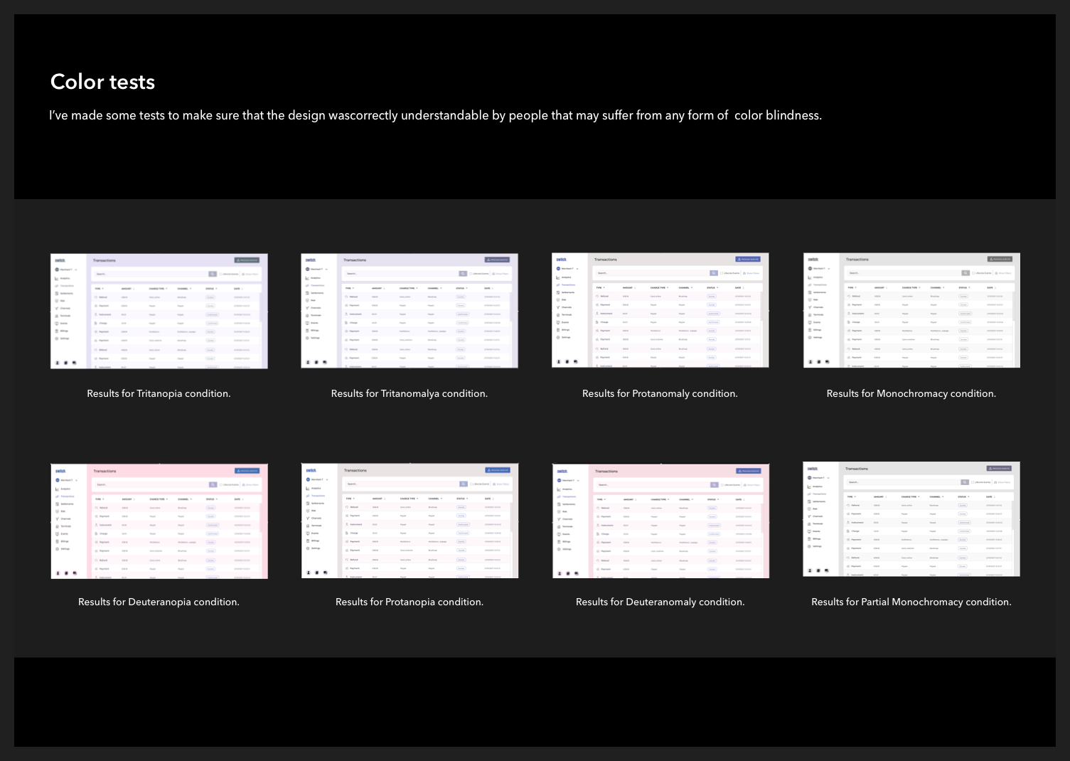 Colour tests
An audit of a provided payment system, identifying inconsistencies and gaps, then proposing a rationalised structure and a set of missing components with usage guidelines.
The internal brand work ranged from event posters and recruitment advertising to social assets and presentation templates — all aimed at helping a smaller consultancy punch above its weight visually in a competitive Porto tech market.


YouTube series cover
Porto Tech Hub — UI Design Lecture
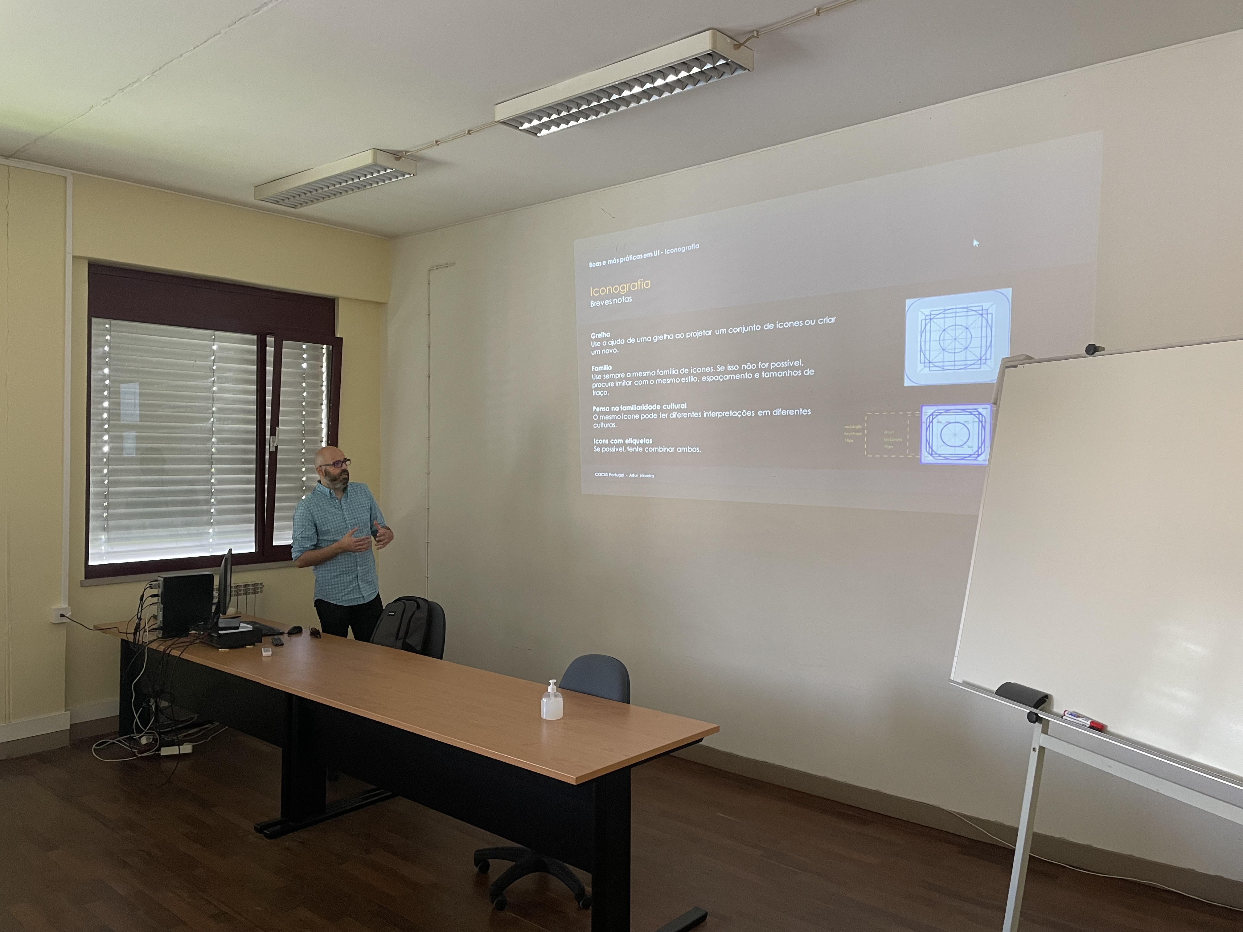
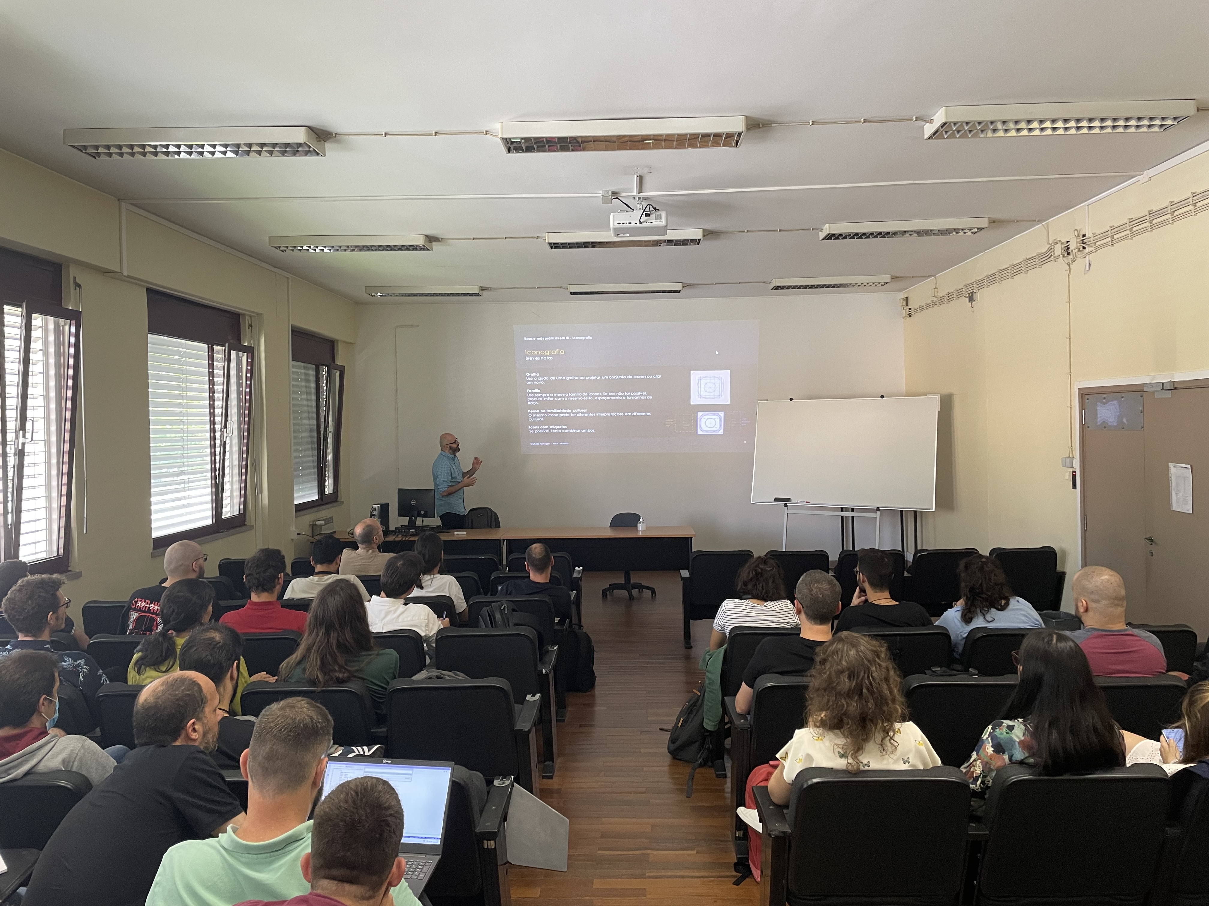
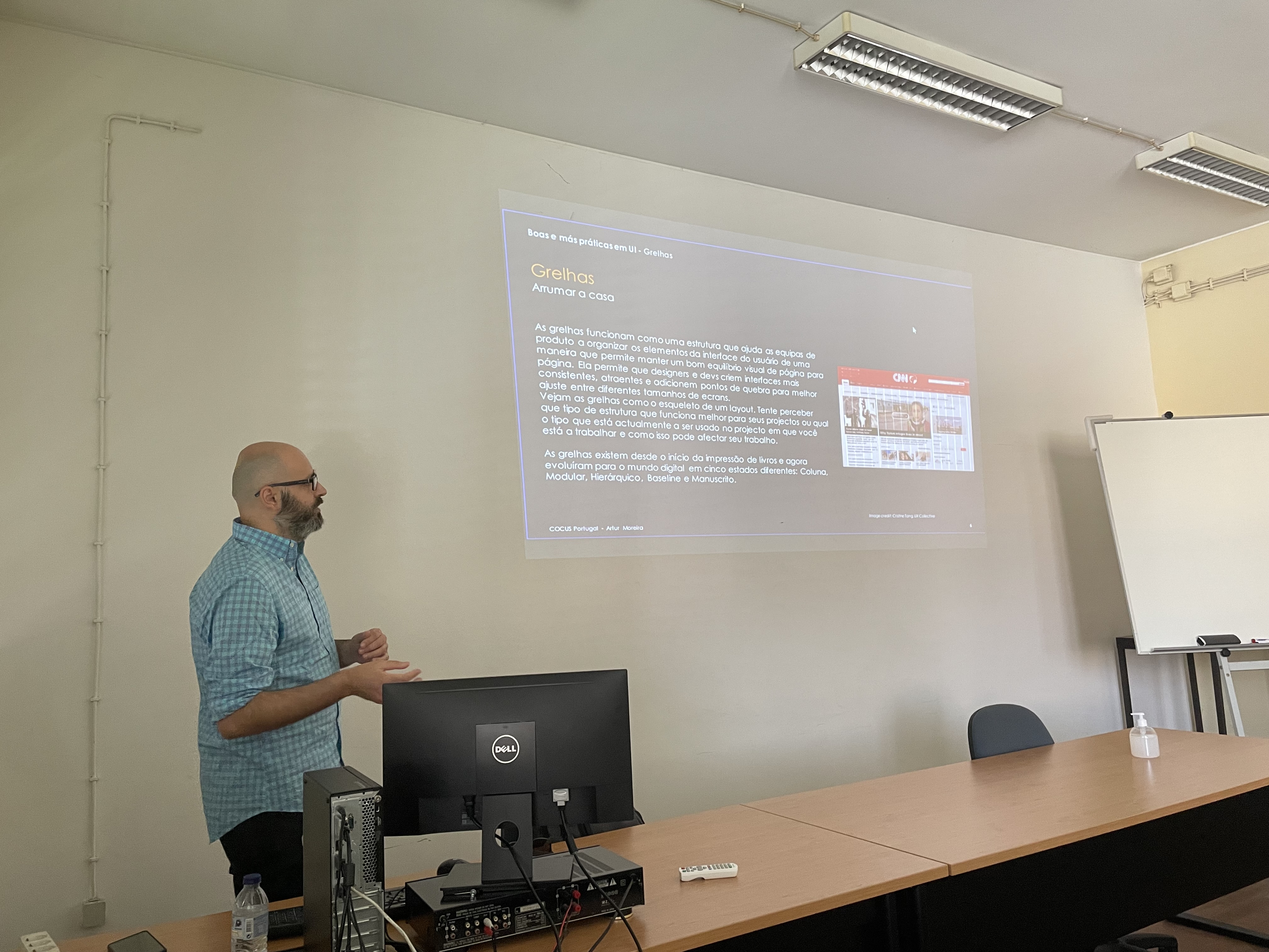
Invited to present at a Porto Tech Hub session to a class of junior developers — making the case for why UI decisions matter in engineering-led teams. Covered visual hierarchy, component thinking, and how design and dev can share a language. One of the more energising things I've done outside of day-to-day product work.

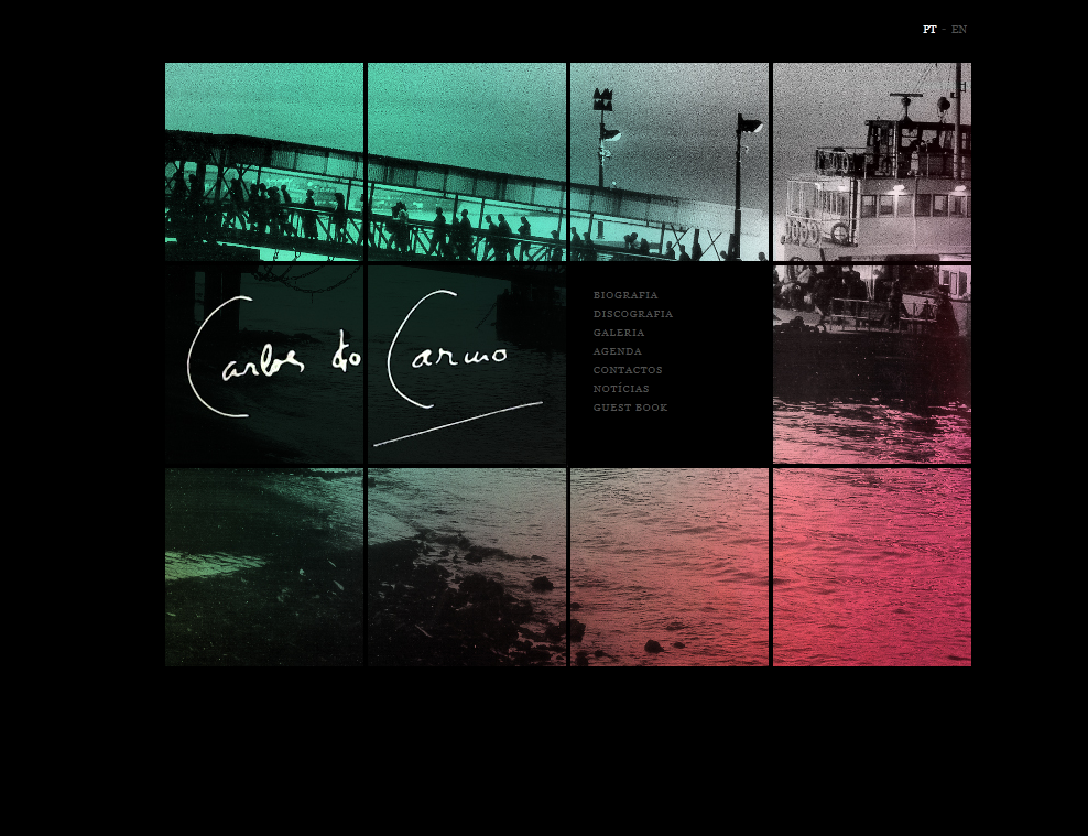
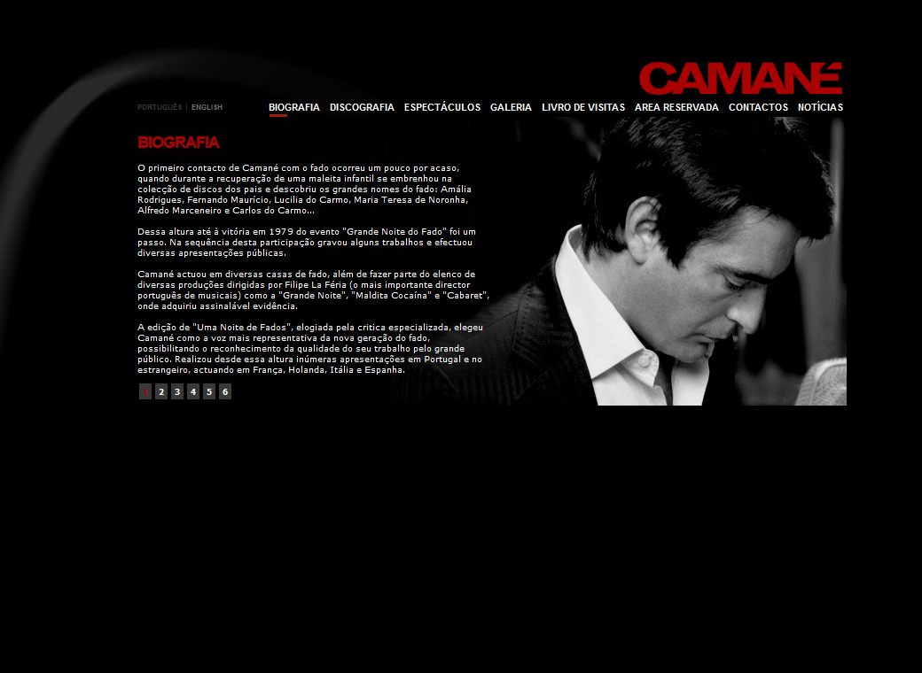
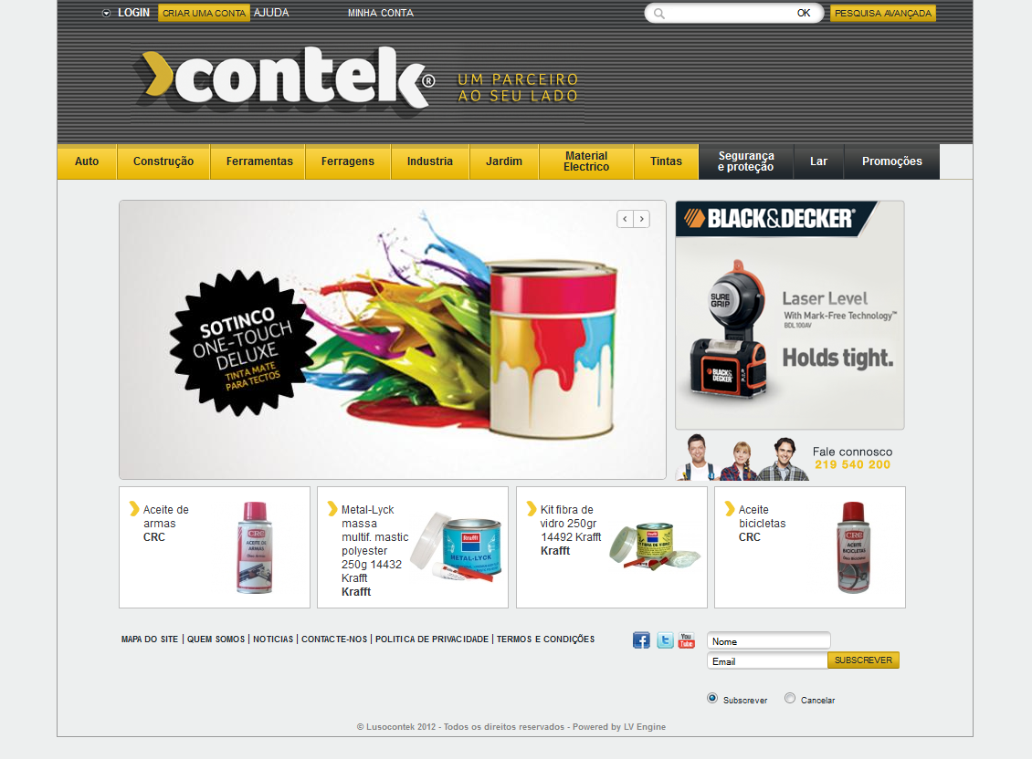
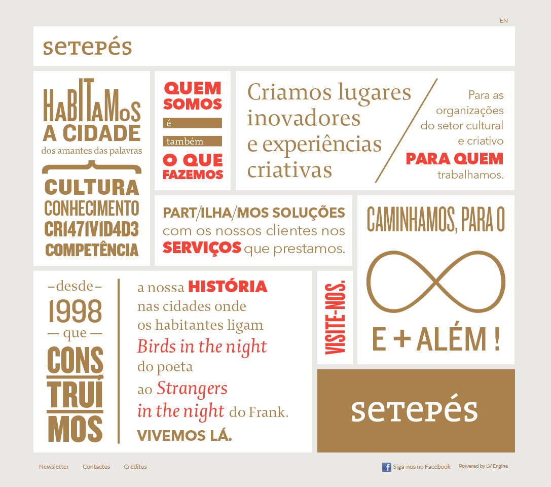
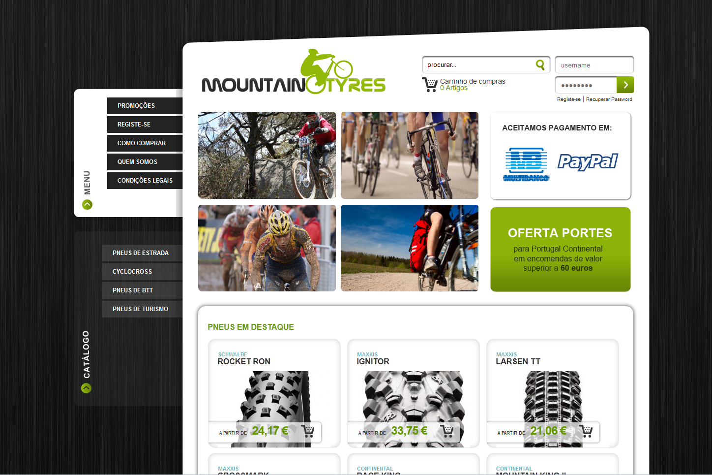
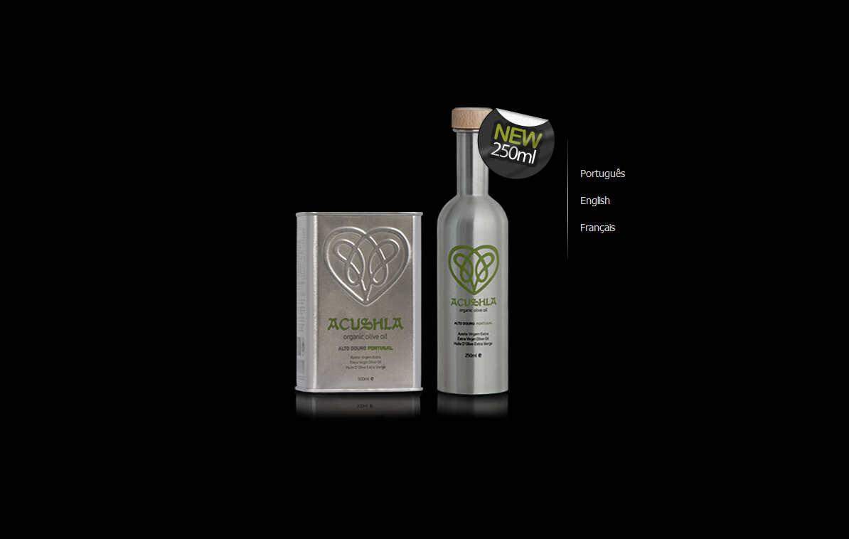
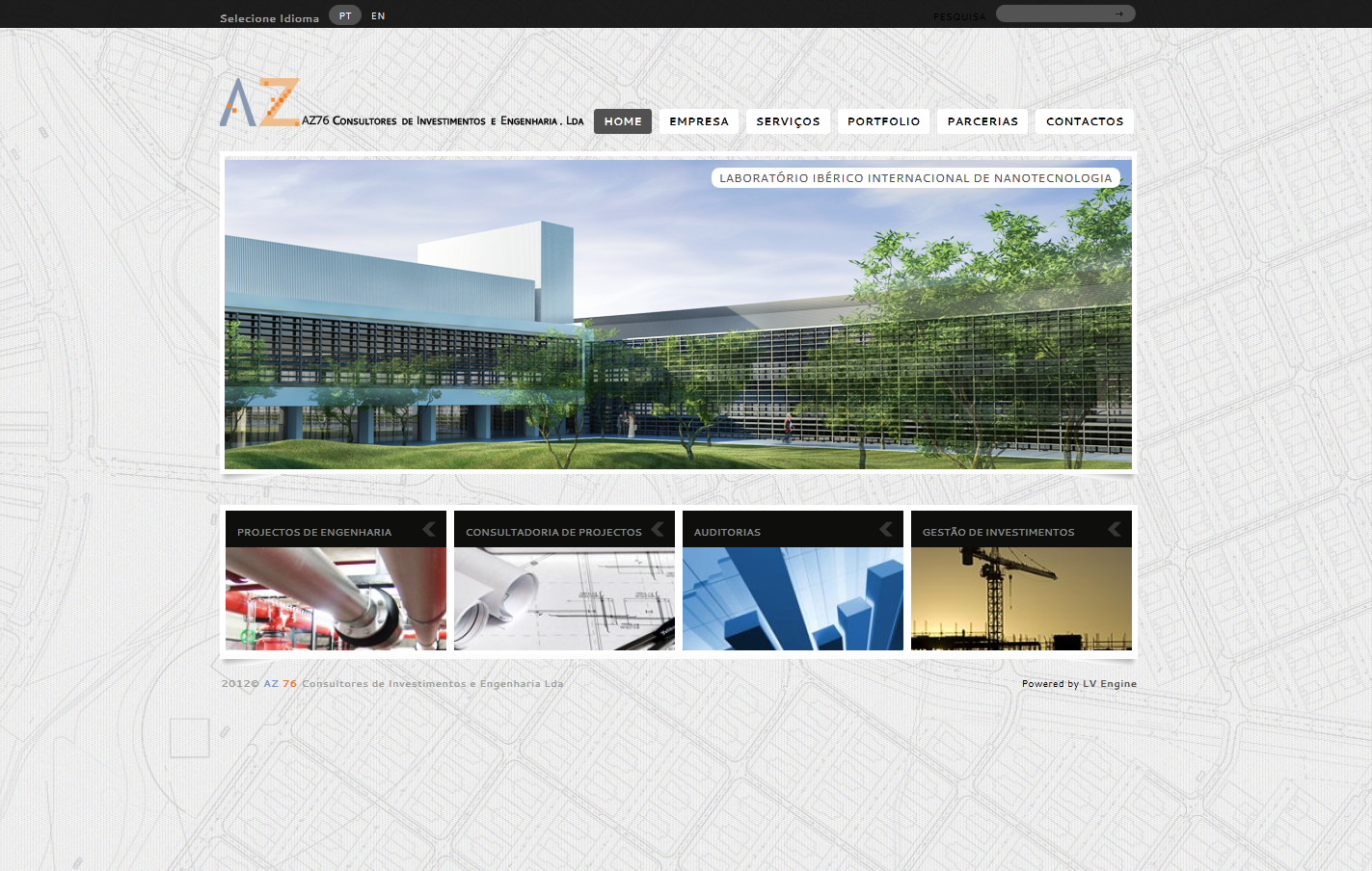
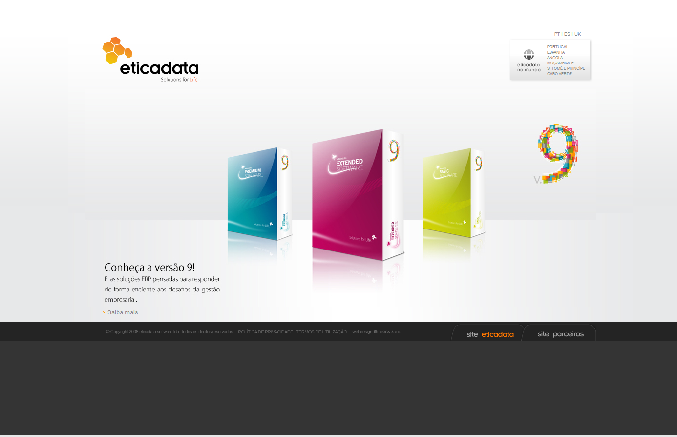
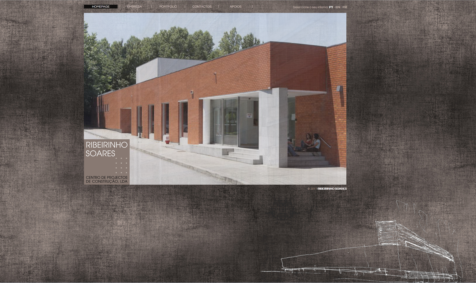
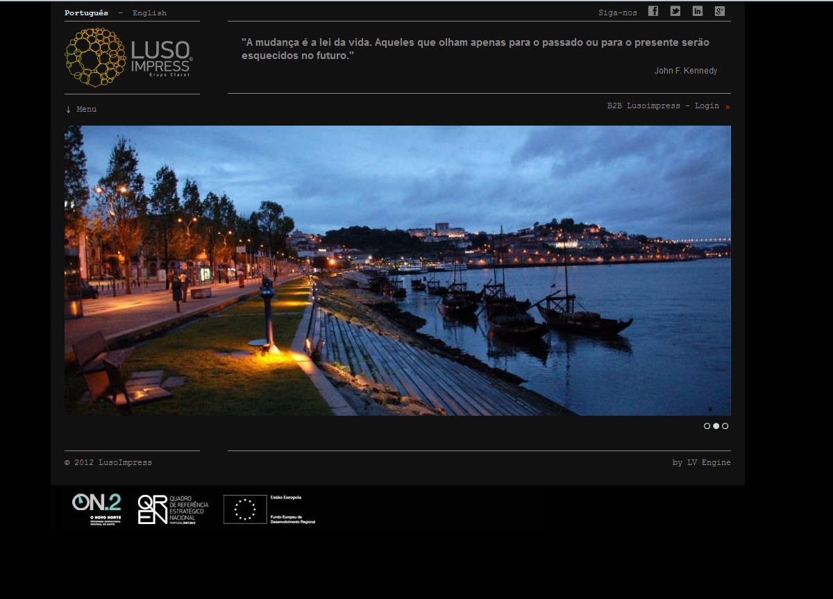
The work at LV Engine was wide-ranging by necessity — a small team serving a diverse client base meant learning to move quickly between disciplines. That range is part of what makes this period worth showcasing: it represents the foundation on which everything else was built.


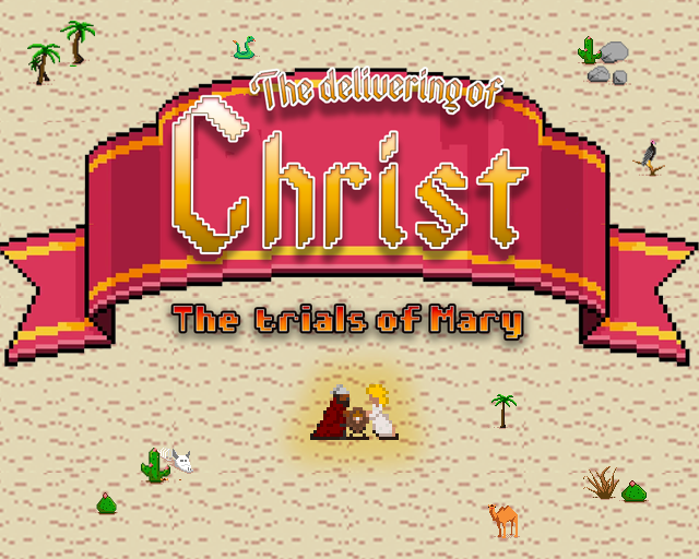
The Trials of Mary
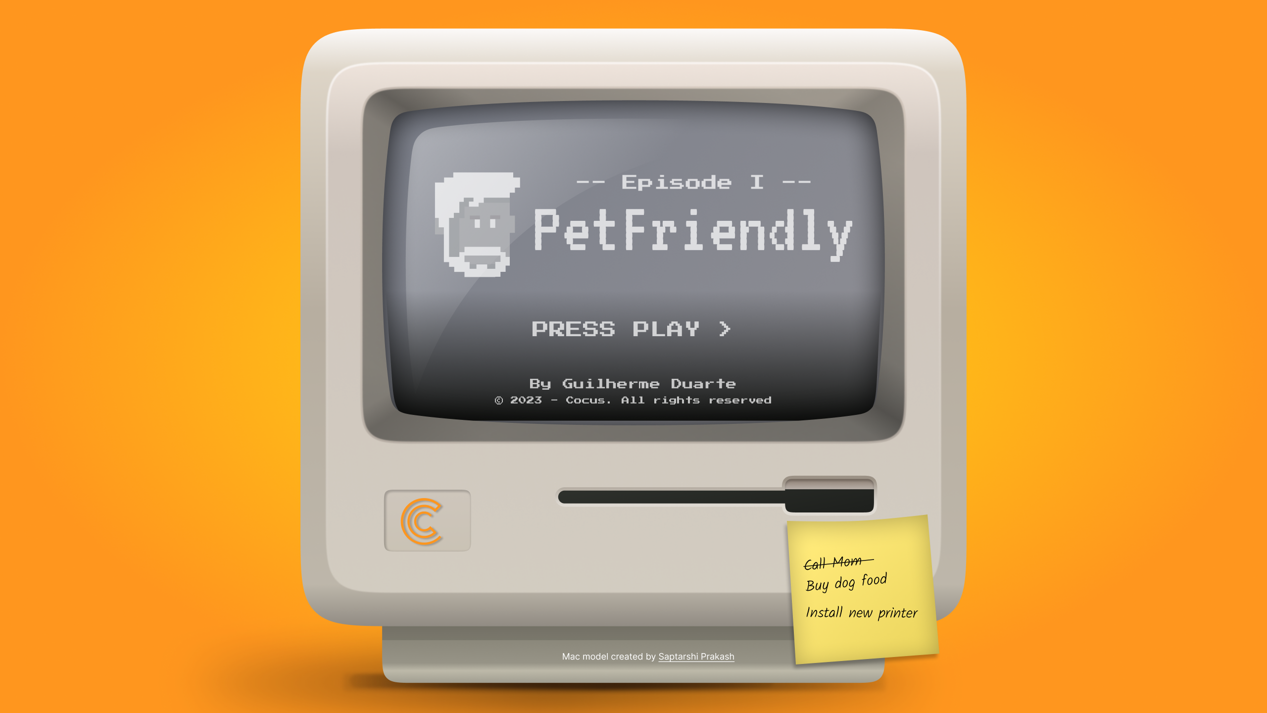
The theme for Ludum Dare 53 was "Delivery" — which led to a game about the most consequential delivery in history. Built in collaboration with a friend who handled the development while I covered all UI, visual design, character art, and level layout.
Working to a 72-hour limit with a collaborator on a completely different kind of brief is a good reminder of the design instincts that never turn off — layout, legibility, feedback, tone. The constraints were unusually honest.
View entry on Ludum Dare