Basecone · Wolters Kluwer · Web Application · 2020
Basecone's
Other Work
A selection of UI and UX improvements from my time at Basecone — spanning the app shell, account configurations, data tables, validation flows, automation, communications, and empty states.
A rework of Basecone's core app shell — introducing a collapsible left navigation bar and a slide-in panel system for user and settings access from the top right corner.
ShippedNavigationApp Shell
The left navigation bar had always been fixed — useful when you knew the product, but a permanent cost to screen real estate for users working on dense booking or OCR tasks. The updated shell introduced a collapsible sidebar: expanded for orientation, collapsed to a compact icon rail during focused work. The transition was designed to feel smooth and intentional, not jarring.
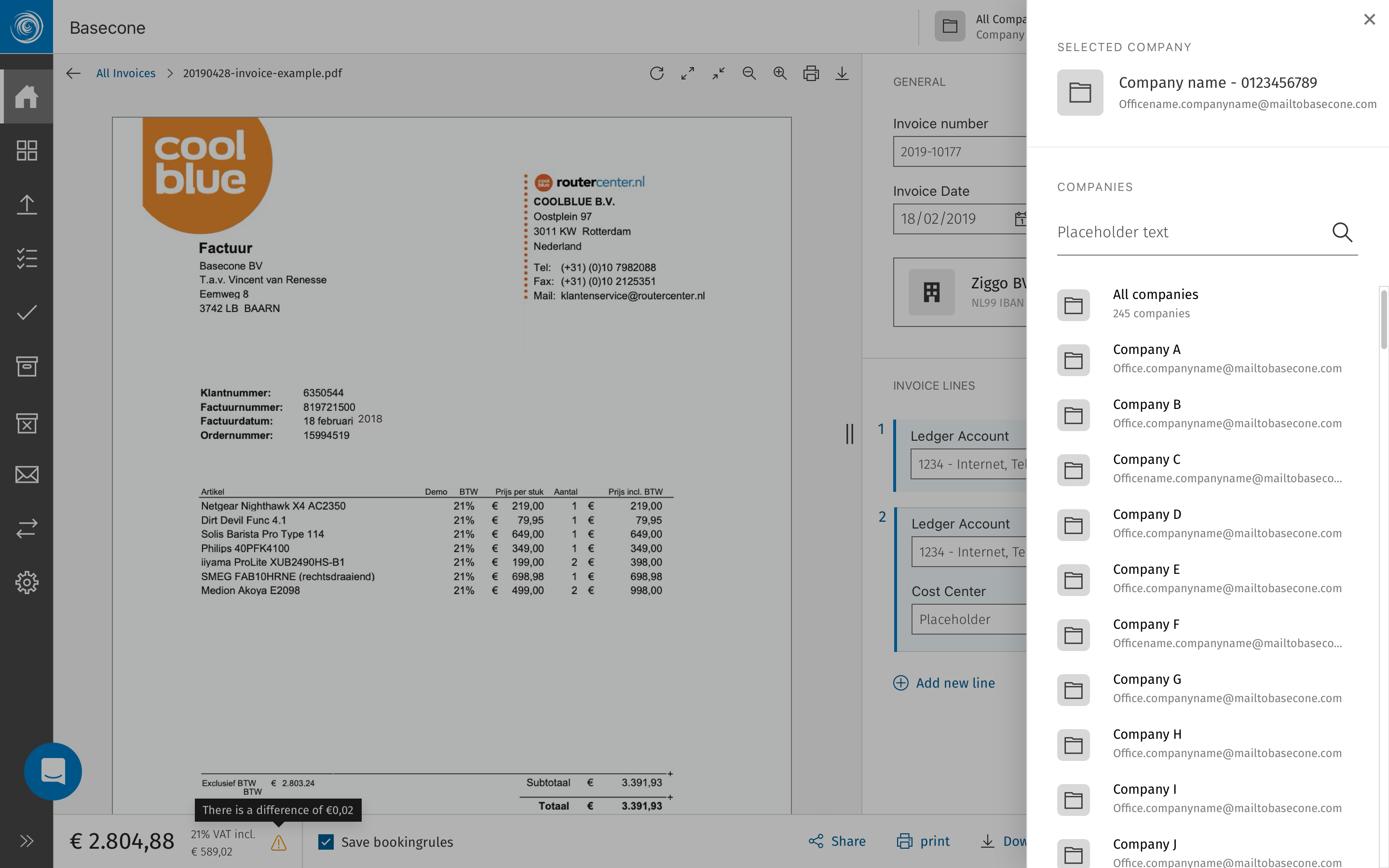
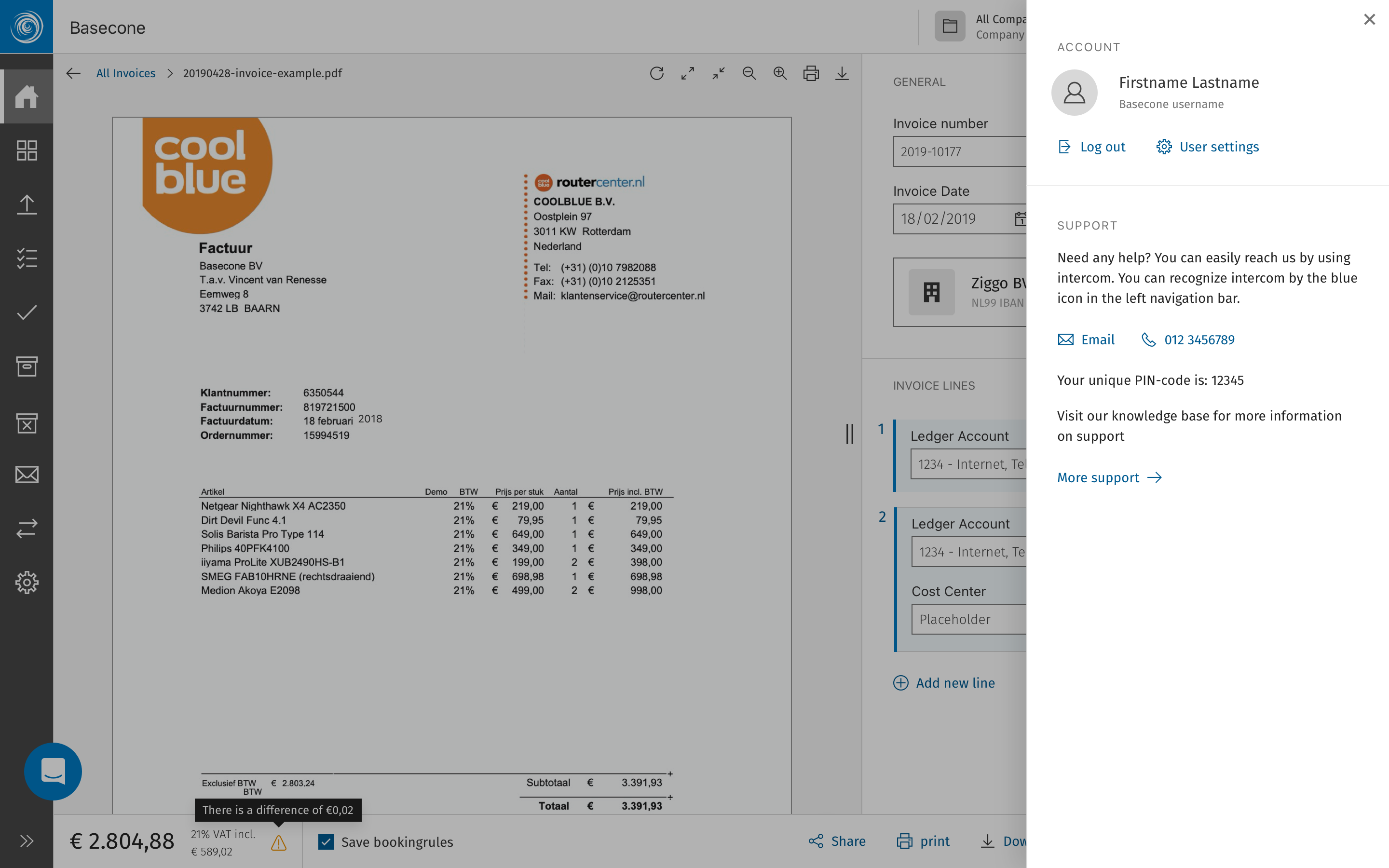
The top-right corner was equally underserved. Clicking the user avatar or settings icon now opens a modal panel sliding in from the right — keeping context intact while surfacing account details, preferences, or company-level configuration without a full page navigation.
Navigation — expanded
Navigation — collapsed to icon rail. This was the standard view
User panel — slides in from right
Settings panel — same interaction pattern
02 of 09Account Config, Export & Migration
Basecone · Web Application · Configuration
Revisiting a process that users dreaded
Account configuration, document exports, and the migration process were once the most friction-heavy areas of Basecone. These were high-stakes tasks with low clarity, trapped in a UI that simply hadn't kept pace with the rest of the product. This was a full UX and UI revision centred on turning these "black box" moments into transparent, reliable workflows.
ShippedConfigurationUX Revision
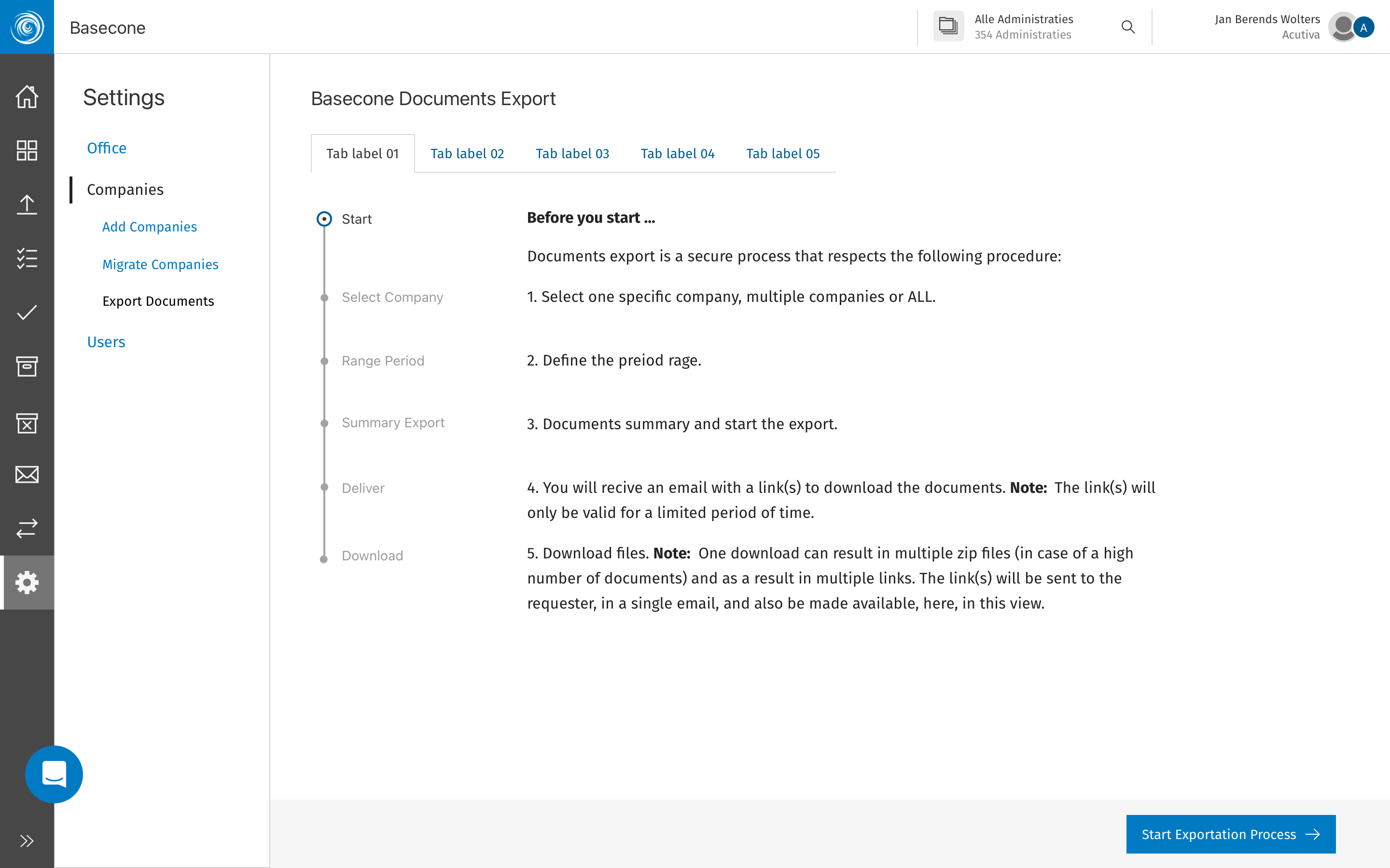
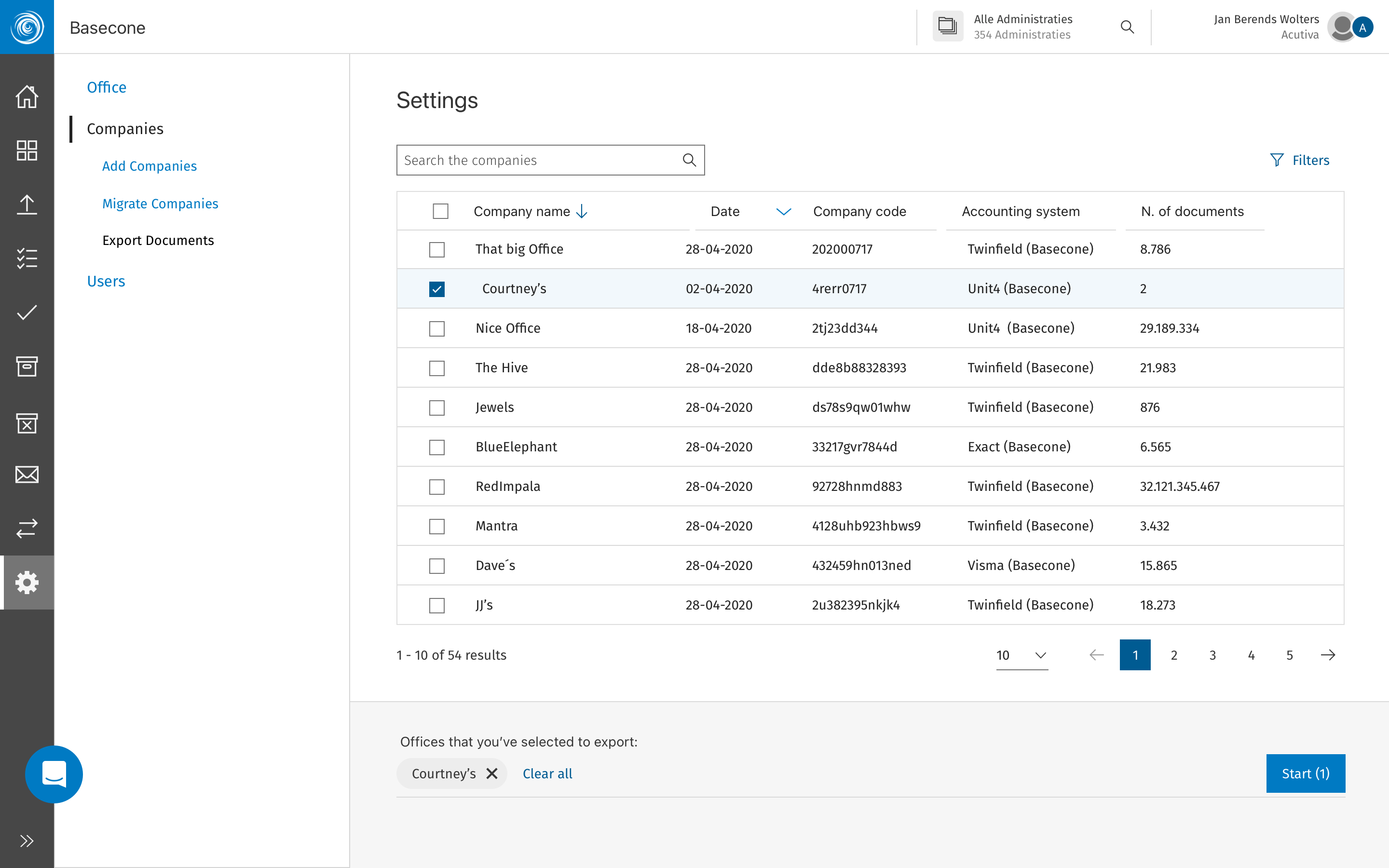
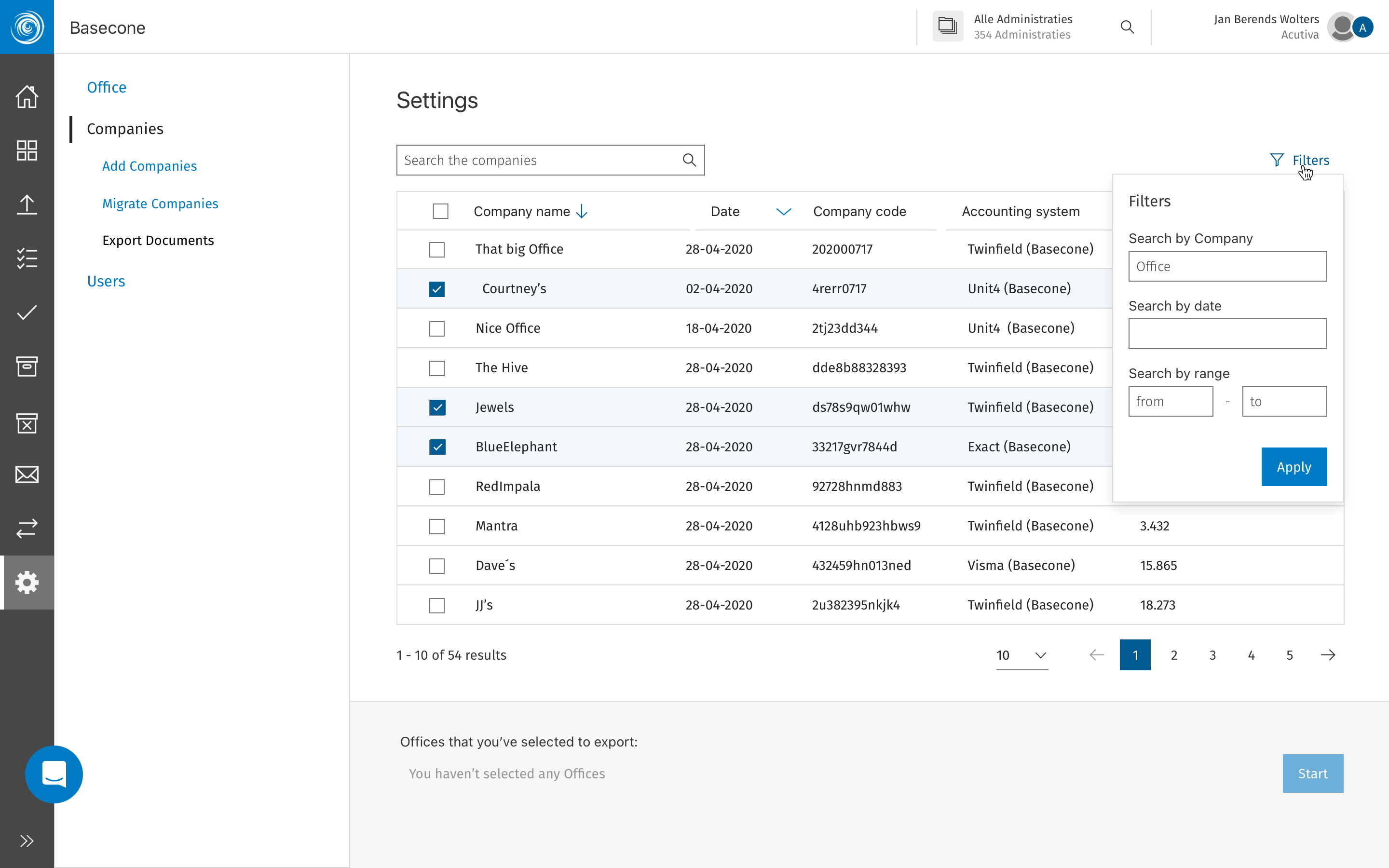
The original configuration and export screens were built when the product was much smaller. As Basecone grew, the complexity of moving financial data and setting up new accounts increased, but the UI never caught up. Users handling critical document exports or migrating from legacy systems were faced with dense, intimidating forms and a complete lack of feedback. There was no sense of progress, leaving users to wonder if their data was actually moving or if the process had simply stalled.
The revised flow transformed these experiences by introducing a clear, modular structure with explicit status feedback at every stage. For document exports and migrations specifically, I redesigned the interface to provide real-time guidance and "pre-flight" checks. Instead of the "is it working?" anxiety of the old system, users now have total visibility over what has been completed and what is still pending. This shift not only reduced the dependency on support tickets during onboarding but turned the most dreaded parts of the app into a guided, high-confidence experience.
Documents export — step 1 structure
Documents export — Data selection
Documents export — Multi-selection and filters
03 of 09Tables & Overview Updates
Basecone · Web Application · Data Display
Making dense data scannable
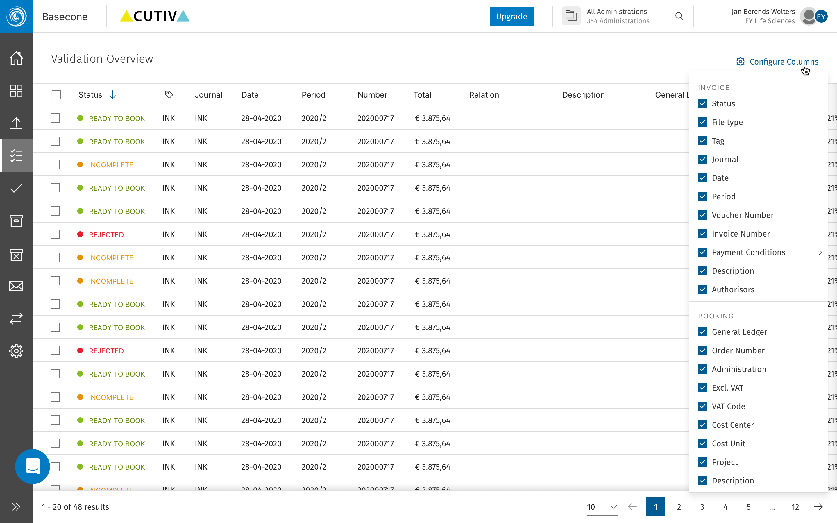
Basecone's tables and overview screens were the workhorses of the product — used dozens of times a day by finance professionals managing high volumes of invoices and bookings. The UX and UI case here was about density, clarity, and speed.
ShippedData TablesUX & UI
Users working through hundreds of rows a day need tables that communicate status at a glance — not tables that require reading. The update introduced a tighter, more consistent row structure, clearer status indicators, improved column hierarchy, and better use of colour to signal urgency without adding noise. Sorting and filtering were also reworked to be less buried and more predictable.
The overview screens received the same treatment: a more purposeful layout that surfaced the most actionable items first, with better use of empty states and loading patterns to reduce uncertainty during slower data fetches.
Table — Filtering
Table — Selected and hover
Table with document preview
04 of 09Validation Overview
Basecone · Web Application · Booking Validation
Turning a bottleneck into a streamlined review
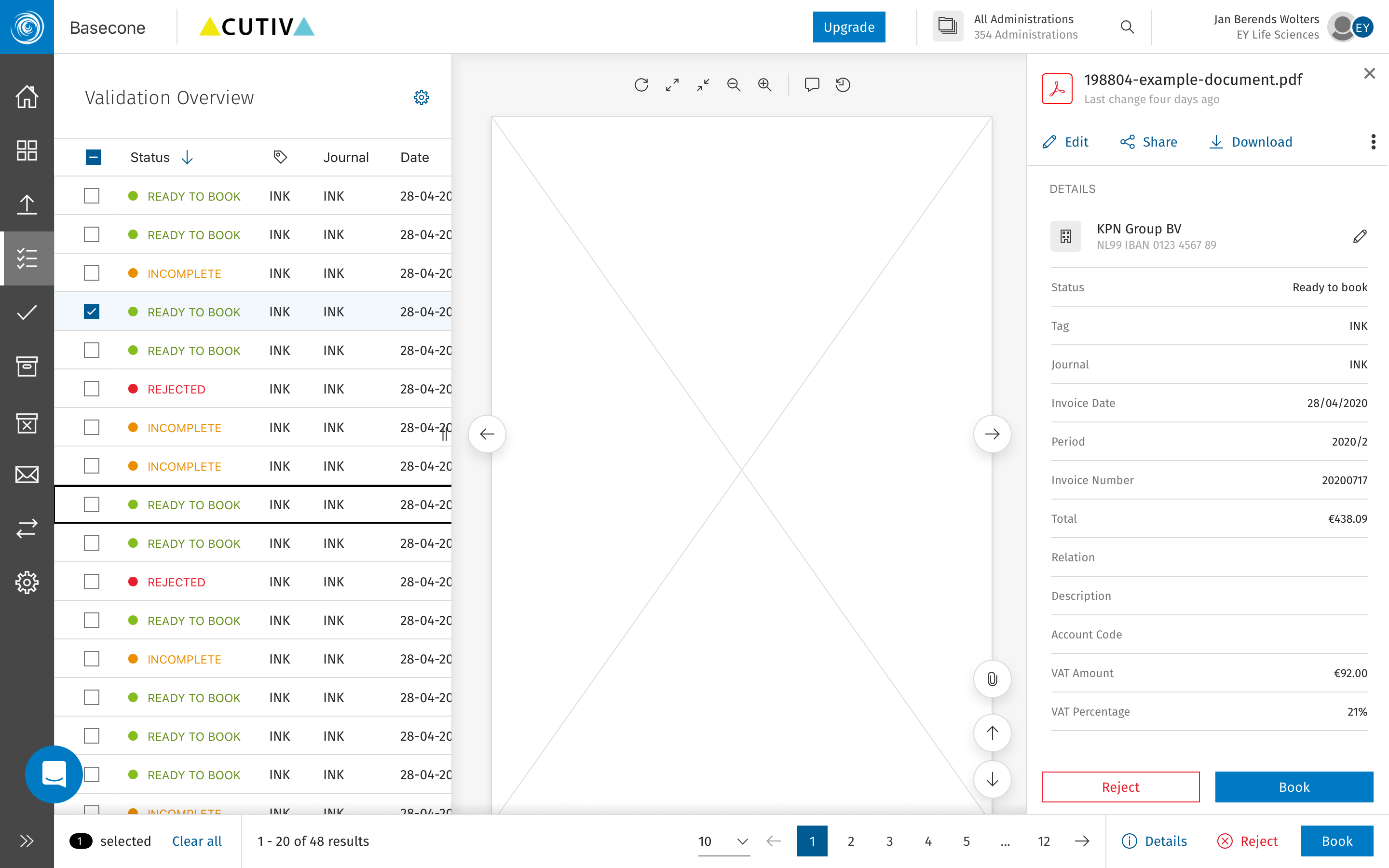
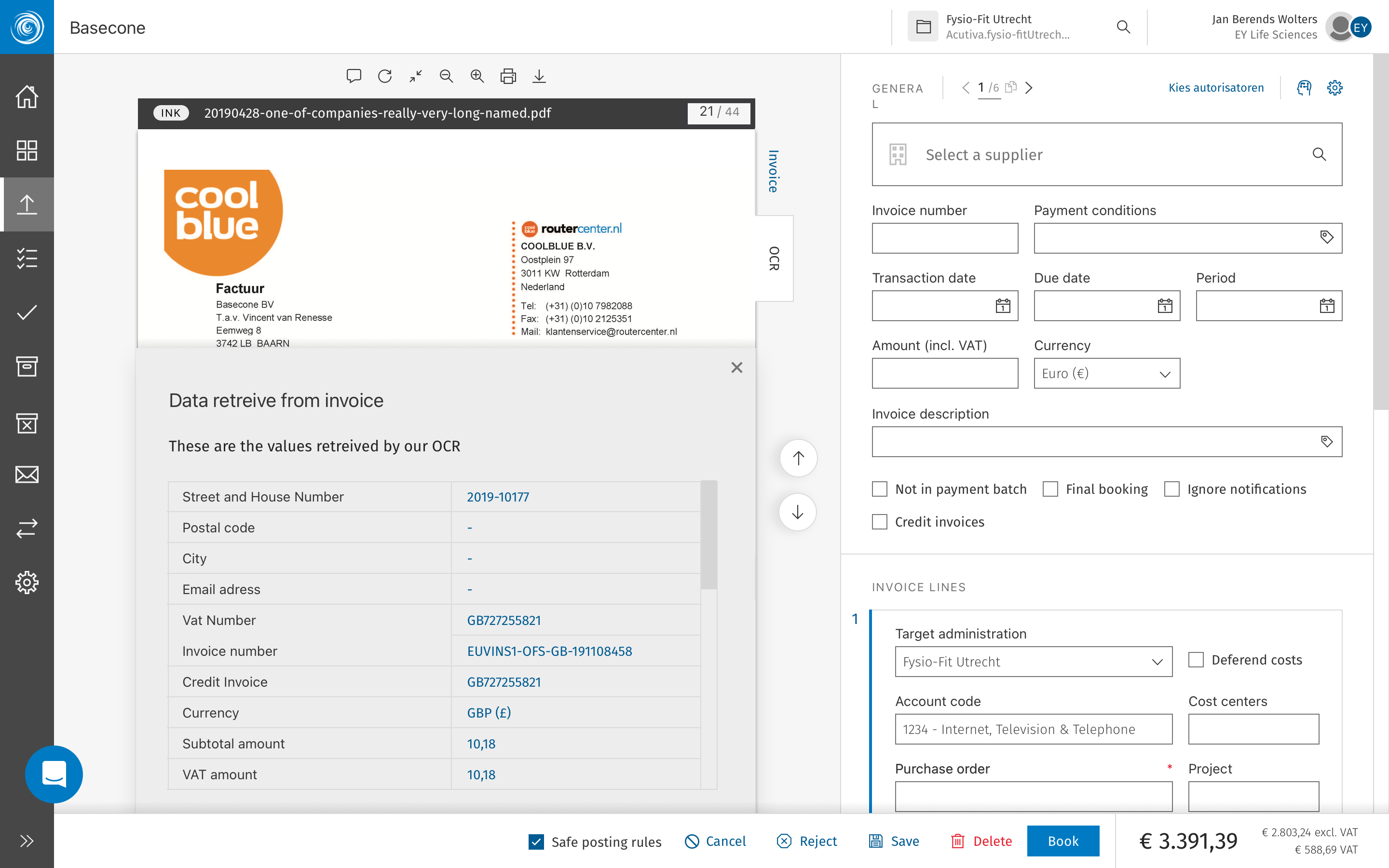
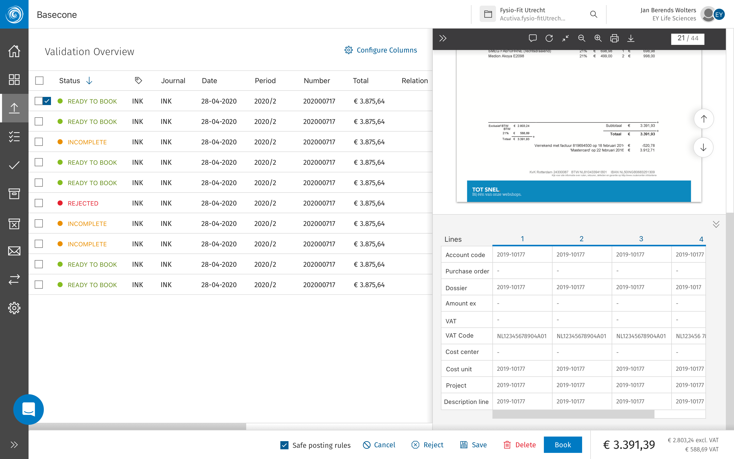
The validation overview is one of the highest-frequency screens in Basecone — where bookers and bankers review, approve, or reject invoices before they're committed to the ledger. Getting this right had a direct impact on daily efficiency.
ShippedValidationBooking Flow
The existing validation screen mixed too many states and actions in an unclear layout. Users had to hunt for what needed their attention, and the primary actions were not prominent enough for such a high-stakes interaction. The update restructured the screen around a clear review-and-act model: what needs attention is surfaced first, the invoice preview is always visible, and the booking action is never more than one click away.
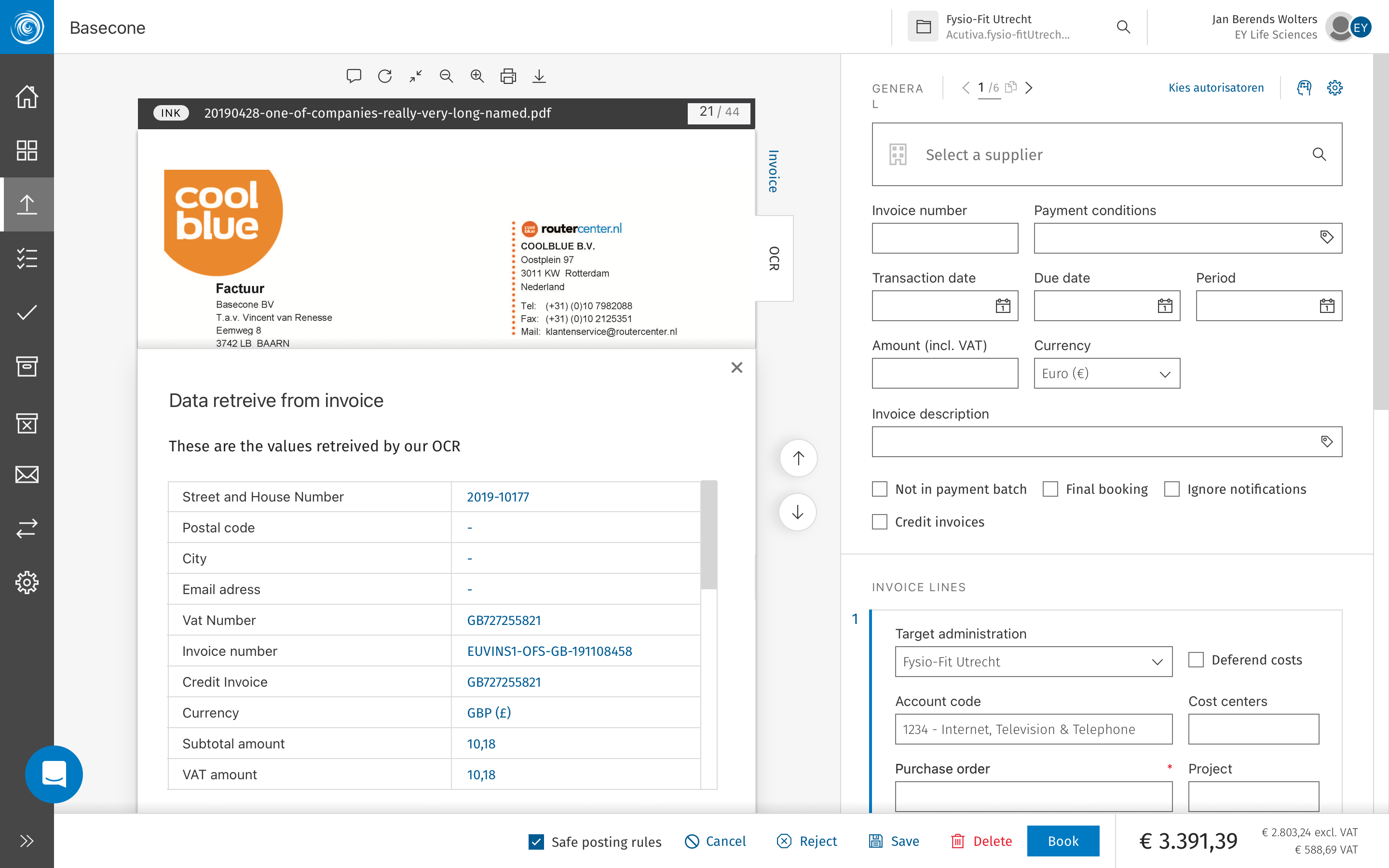
Validation - before OCR detects fields and values
Validation - after OCR finds and fills the missing fields
OCR information added as list in the document
05 of 09Supplier Review & Booking
Basecone · Web Application · Supplier Management
A clearer path from supplier to booked line
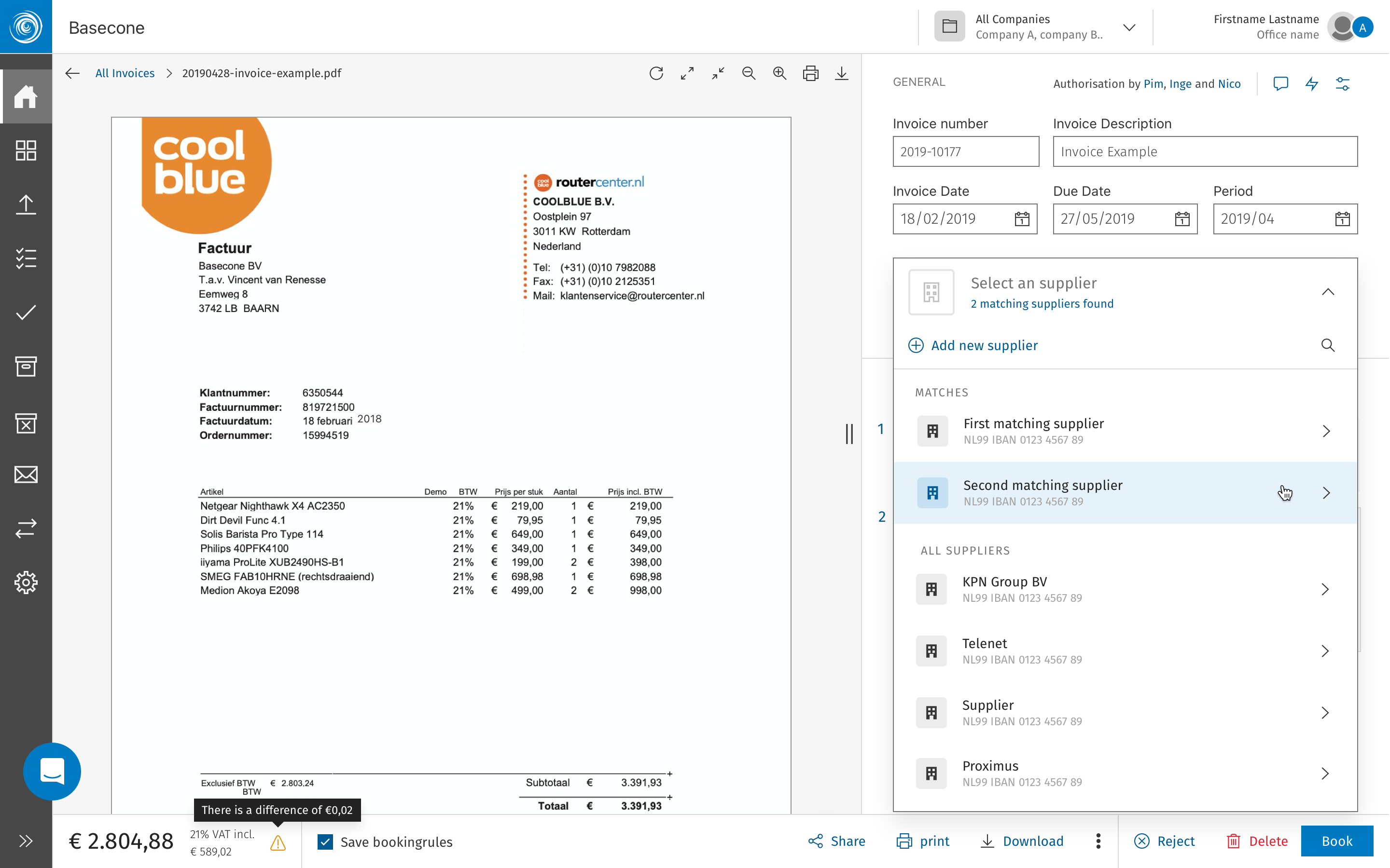
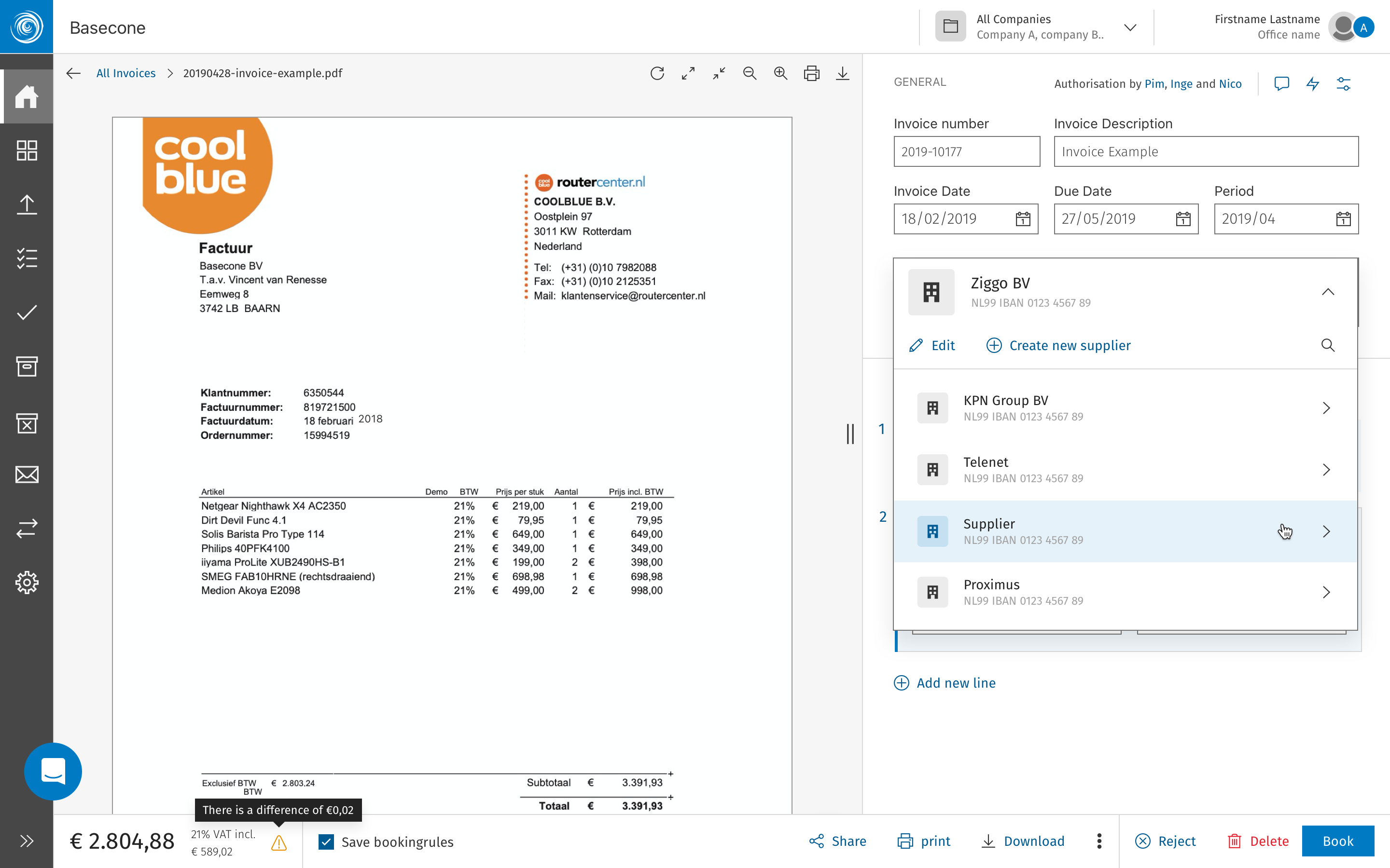
Adding a supplier to a booking was one of the most common — and most error-prone — actions in Basecone. The review process lacked structure, leaving users uncertain whether a supplier was valid, complete, and ready to commit before the booking was finalised.
ShippedSupplier ManagementBooking Flow
The original flow asked users to search for a supplier, select it, and proceed — with no intermediate step to confirm the supplier's details were correct or complete. Incomplete supplier records caused downstream errors in the ledger, and the only feedback came after the booking had already been submitted. The revised process introduces an explicit review step between supplier selection and booking confirmation: key supplier data — VAT number, IBAN, and account mapping — is surfaced for a quick sanity check before the user commits.
The review panel also flags suppliers with incomplete or mismatched records, giving users the option to correct, override, or escalate before the booking goes through. This single addition significantly reduced the rate of rejected bookings caused by supplier data issues.
Supplier search — selection or creation step
Supplier search — type of service selection
Information added
06 of 09Internal Messages
Basecone · Web Application · Feedback System
A consistent voice for system feedback
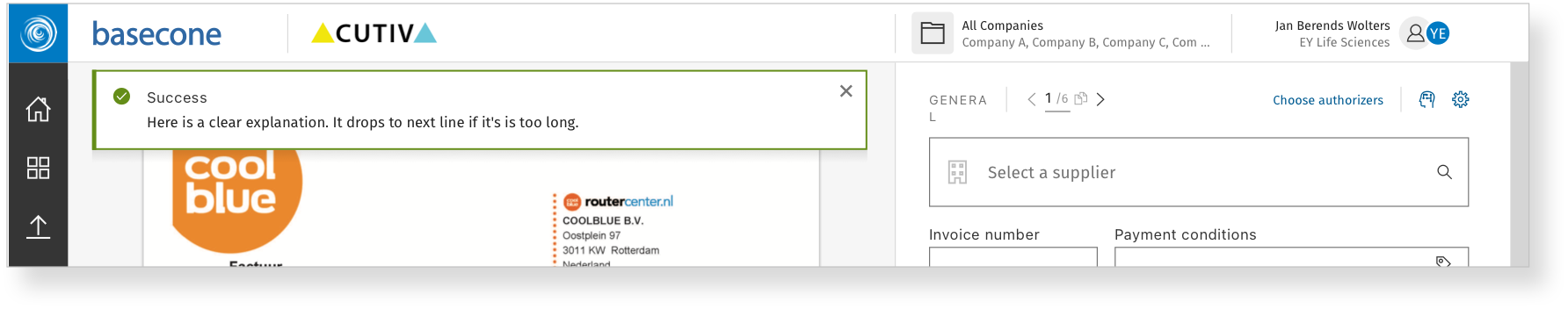
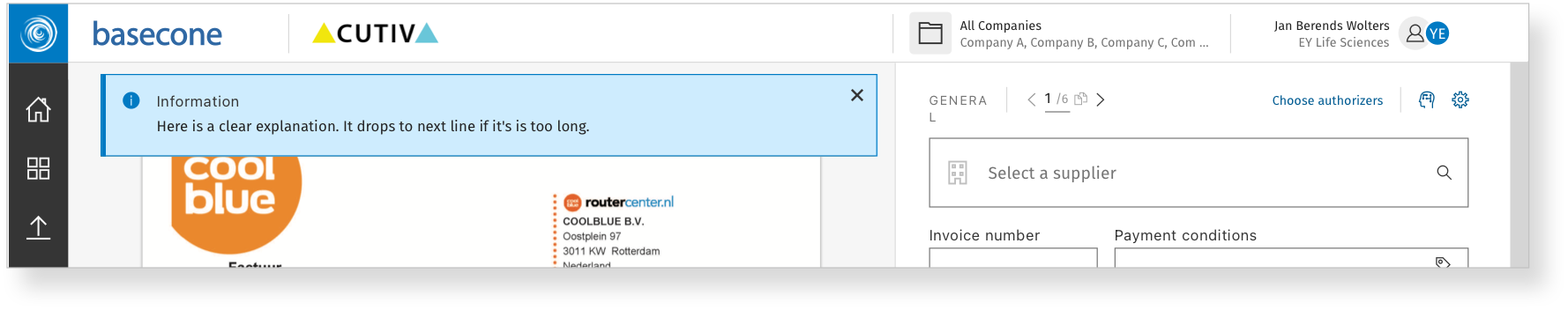
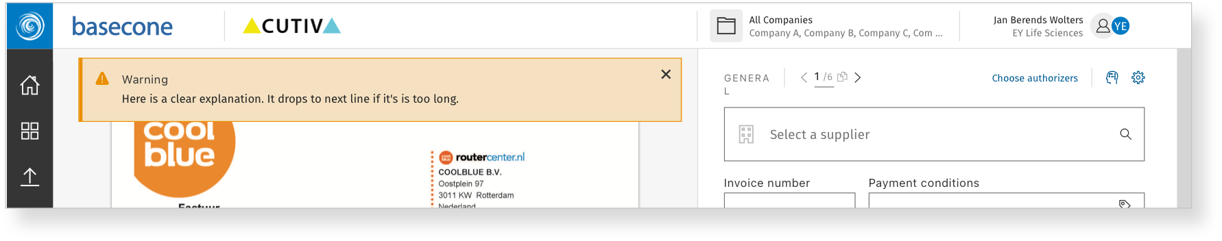
Basecone's toast notification system had grown inconsistently — different colours, varying copy tone, and no shared visual structure. The update standardised the full set across six core message types.
ShippedNotificationsDesign System
Toasters are small but frequent — they're the system's voice, appearing at moments of action, error, or confirmation. When they look inconsistent or speak in an unpredictable tone, trust erodes quietly. The redesigned set establishes a clear visual hierarchy across six types: success, error, warning, info, loading, and neutral. Each has a consistent structure — icon, message, optional action — and a copy tone that matches the weight of the moment.
Success
Error
Info
Warning
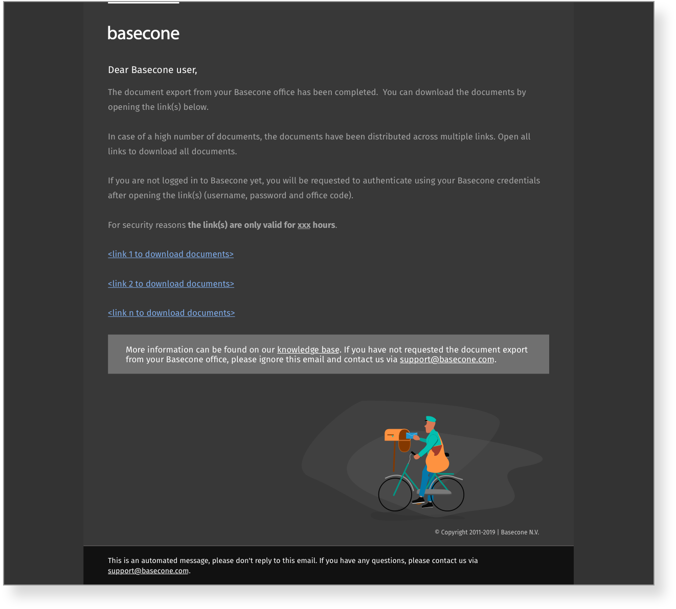
07 of 09Email Updates
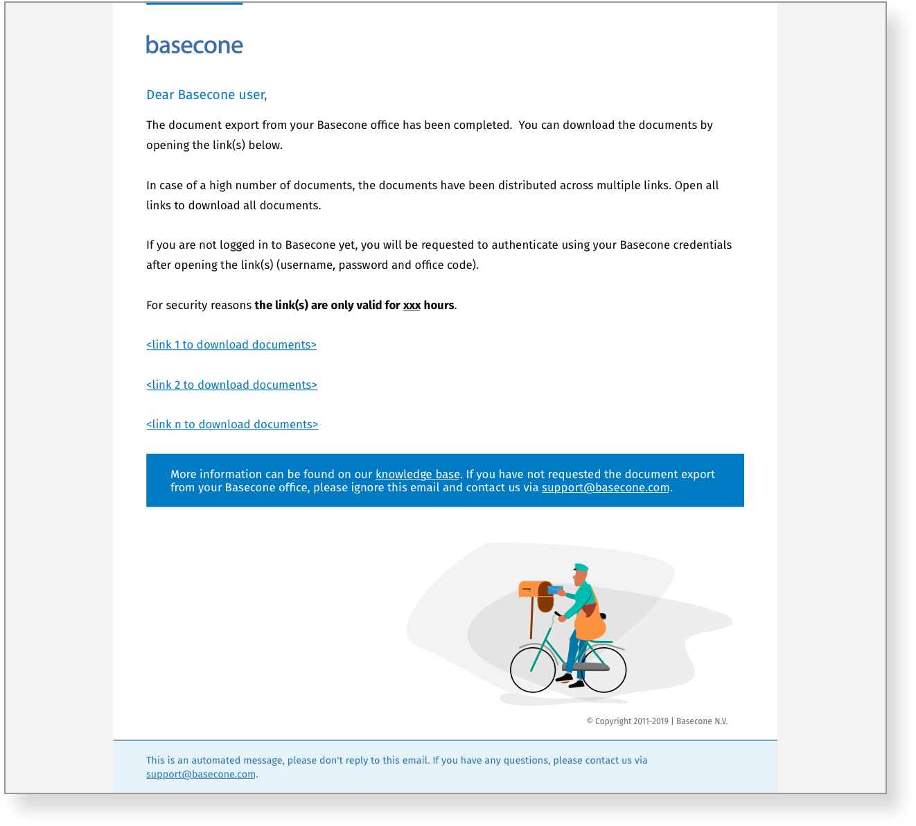
Basecone · Transactional Email · Outlook 5.0 Compatible
A new tone, new illustrations — and a very old inbox
Basecone's transactional emails received a full refresh — new brand tone, new custom illustrations, and a layout built to render correctly in Outlook 5.0 and older legacy mail clients used across the finance sector.
ShippedEmail DesignIllustration
These emails were designed to be compatible with Outlook 5.0 and older legacy clients. This required table-based layouts, inline styles, and fallback-safe illustration formats — a significant technical constraint that shaped every visual decision.
Basecone's email communications had inherited the same visual debt as the rest of the product — no consistent tone, no illustration system, and a layout that had been patched over time rather than designed. For many users, these emails were the product's most visible touchpoint outside the app itself.
The refresh established a warmer, more direct copy voice — professional but human. Custom illustrations were created for each key email type, maintaining personality within the severe constraints of legacy mail client rendering. The layout used a bulletproof table-based structure that was tested across Outlook 5.0, Outlook 2010, and a range of webmail clients.
Simple email
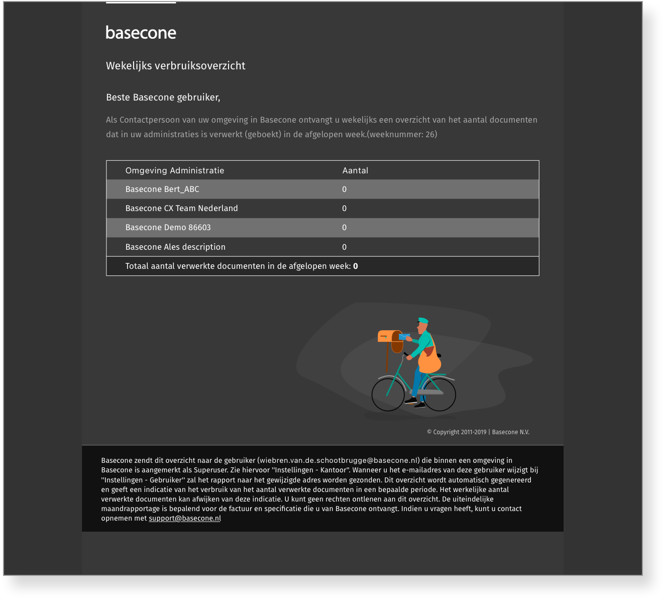
Simple email - Darkmode version
Email with tables
Email with tables - Darkmode version
08 of 09Mobile Illustrations
Basecone · iOS & Android · Empty States
Empty states that earn their moment
Four illustrations designed for the mobile app's empty and idle states — each contextually matched to its specific screen, turning low-information moments into something considered and on-brand.
ShippedIllustrationMobileEmpty States
Empty states are easy to overlook — they only appear when nothing is happening. But they're also moments when users are waiting, uncertain, or mildly frustrated. A generic placeholder does nothing for confidence. A contextual illustration can quietly reassure, orientate, or even add a moment of warmth to an otherwise uneventful screen.
Each illustration was given a distinct mood matching its context: the invoice empty state is focused and task-ready; the empty inbox is calm and reassuring; the error state is honest but not alarming; and the no-tasks state is the most relaxed of the four — a small visual reward for an up-to-date workload.
No invoices to work on
No unread emails
Generic error
No tasks or calendar updates
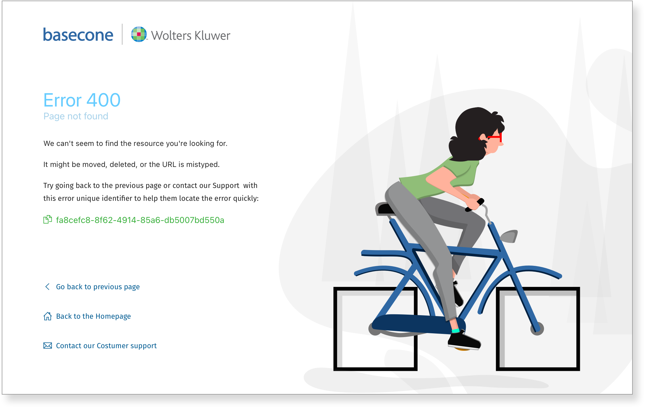
09 of 09404 & Error Pages
Basecone · Web Application · Error States
Three problems, three examples each
A set of error page designs covering three distinct failure scenarios — each presented across three layout examples, showing how tone and visual treatment adapt to the nature and severity of the problem.
ShippedError Pages404
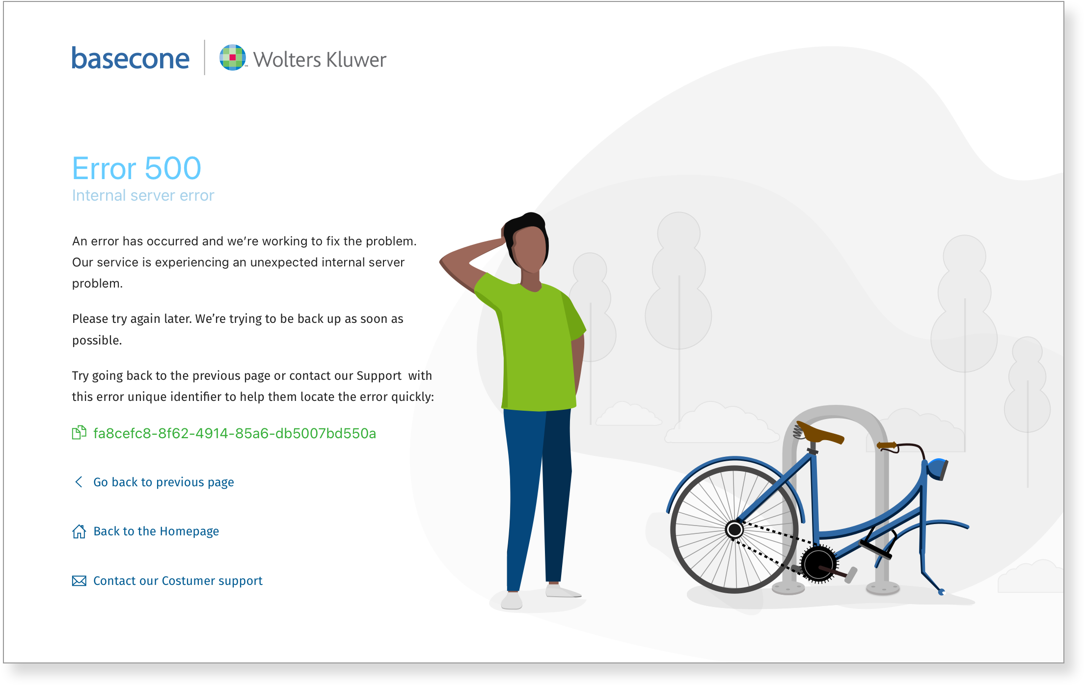
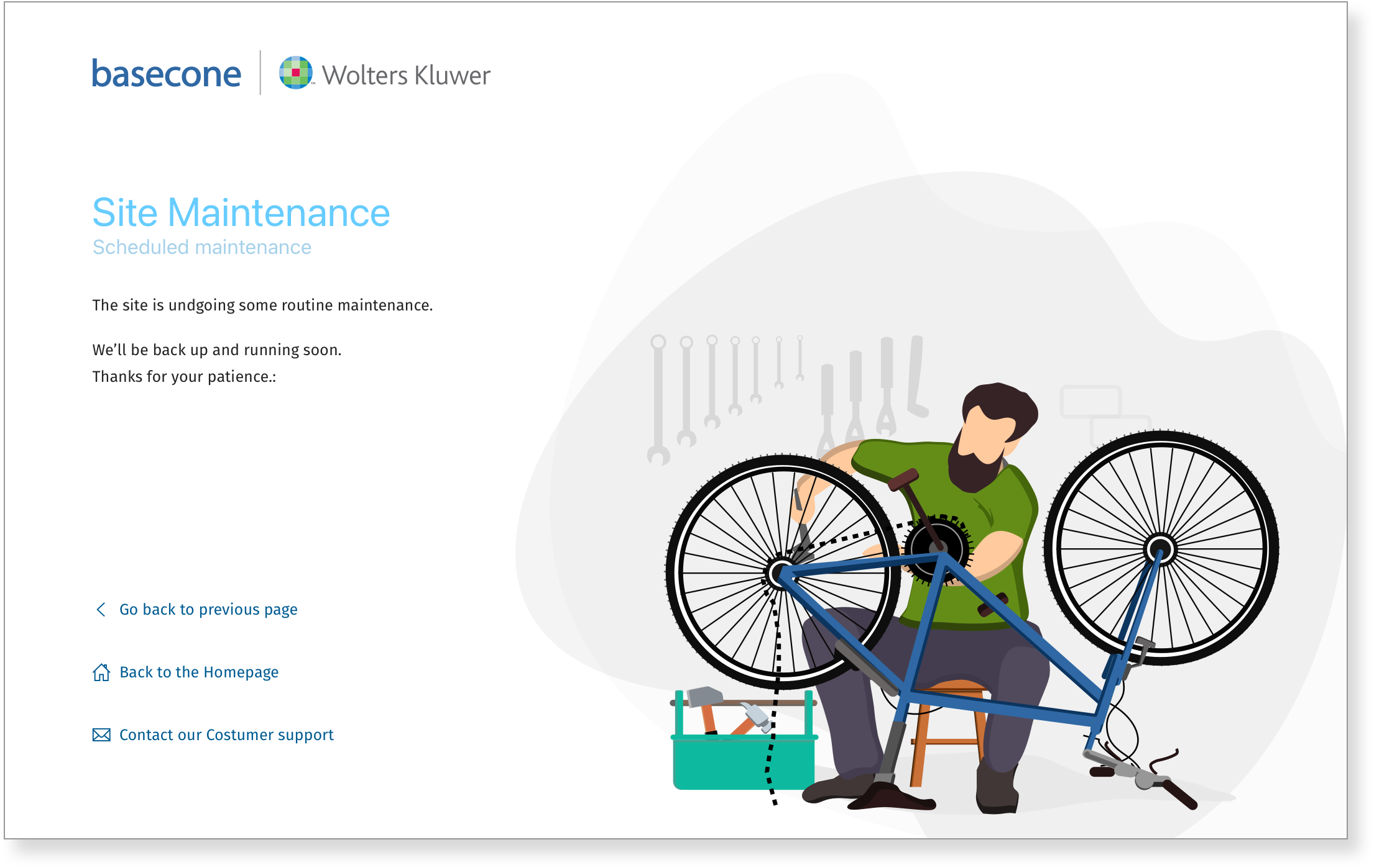
Error pages in a professional finance tool carry more weight than in a consumer app. A user hitting a 404 mid-workflow, or landing on a permissions error at an inopportune moment, needs clarity above all — what went wrong, whether their work is safe, and what to do next. The designs prioritised brevity, a calm tone, and a clear path forward.
Each of the three error types — not found, something went wrong, and maintenance — received its own visual treatment, with three example layouts showing the range of application across different page contexts.
Error 400
Error 500 - internal server error.
Site under maintenance
✉️ Get in touch
Got a question, a project, or just a great joke? Send over the details and let’s see how we can build something great together.