Basecone · Wolters Kluwer · Web Application · 2019

Basecone coffe icon
Design Transition

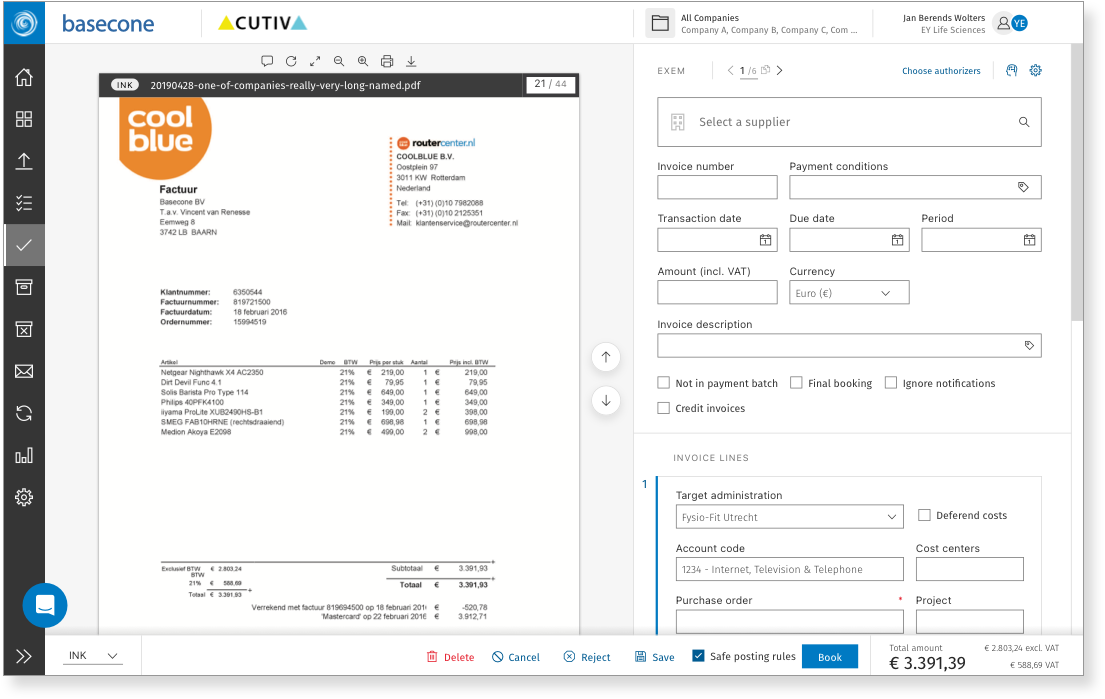
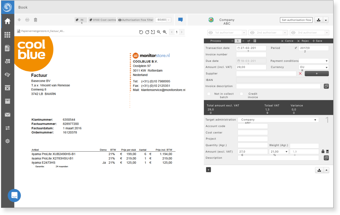
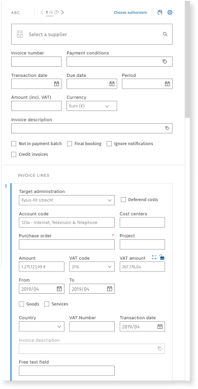
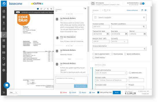
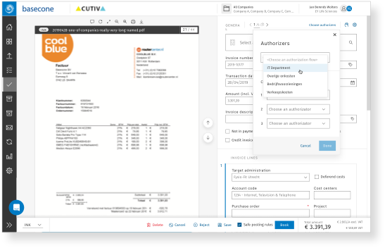
Overhauling a legacy invoice-processing SaaS — improving accessibility, navigation, and daily workflows for thousands of Dutch financial professionals, while aligning Basecone's product identity with its new parent company, Wolters Kluwer.

Summary
Role UX · UI Designer
Team 3 Designers
Platform Web Application (SaaS) · iOS · Android
Duration 6 Months · 3 Phases
Users Bookers · Bankers · Finance
Language Dutch (Primary) · French · English
Year 2019
bike illustration
01. Overview
TA legacy tool, a new owner,
and 4 months to get it right

Basecone was one of the three biggest invoice-processing platforms in the market — used daily by bankers, bookers, and finance professionals to manage bookings, OCR scanning, and financial flows. Following its acquisition by Wolters Kluwer, the opportunity arose to do something ambitious: not just a visual refresh, but a systemic overhaul addressing years of accumulated UX debt.

The biggest constraint was our users themselves. They were very accustomed to the way the tool worked and didn't want anything changed. Our average user was a 52-year-old man or 44-year-old woman, working in Dutch, with years of muscle memory invested in the product. The phased rollout was designed as much for user trust as for delivery risk.

The Wolters Kluwer
opportunity

The acquisition aligned brand, budget, and rationale to push for meaningful product change — not cosmetic updates alone. The product needed to feel part of the Wolters Kluwer family while solving real problems.

The challenge

Users didn't want anything moved. Every change — even beneficial ones — was perceived as a threat to their daily efficiency. We also looked at our competitors (internally and externally), where Basecone was third in the market.


Pain points included: trust issues, resistance to change, an older demographic, Dutch as the primary language, a very slow system, and an OCR tool with no meaningful assistance on the process.

Phase 1 · Navigation

New sidebar, search & top bar

A new left bar with more accessible colours, redefined icons, and an expandable structure. A better top bar where the company logo assumes more importance. Search overhauled and more powerful. User settings more prominent and direct.

Phase 2 · Power Bar + OCR

Context-aware power bar & rebuilt OCR

An overhaul of a poorly constructed OCR tool. New features, updated forms, elements that all belong to the same design system. A power bar at the bottom with the most important elements for each specific page — totals visible, main CTA always present.

Phase 3 · Polish

Micro-updates throughout the app

Small, targeted updates ensuring the entire app felt smooth and cohesive — every screen felt like it belonged together rather than being assembled across three separate releases.

02. Discovery
Research-led foundations

To build a foundation of high-confidence insights, we conducted on-site user interviews, competitive benchmarking, and extensive desk research. By collaborating with customer care teams, we identified recurring pain points and behavioural patterns not visible through data alone.

We looked at our competitors both internally and externally — Basecone was third in the market, giving us clear benchmarks. Accessibility failures, a rushed OCR tool, and high-friction booking flows were the primary targets.

Landing page — after
Landing page — before
Before
After

Move the cursor to compare the old version (2010) with the newer update (2019)


Competitive Analysis

Benchmarked top internal and external competitors — Basecone was third in the market, giving clear reference points.

User Feedbacks

Collaborated with product and support to map recurring pain points, complaints, and workflow frustrations.

Accessibility Audit

Contrast ratios and interactive elements failed WCAG AA in multiple critical areas of the interface.

Flow Mapping

Identified high-friction, high-frequency tasks — booking flows, OCR correction — as primary redesign targets.

03. Insights
Key insight

"Don't move anything. We know where everything is...Just fix what's broken."

— Timo P., Zwolle

User resistance wasn't obstruction — it was engagement. Our users cared deeply about the tool. That gave us a clear design constraint: preserve the spatial logic and information architecture users depended on, while fixing the underlying problems layer by layer. This is why we created phases — to give users time to adapt to the new look and functionality before introducing the next change

Accessibility

Contrast failures, ambiguous icons, and non-compliant interactive elements — most impactful for the older demographic that made up the majority of users.

Navigation Friction

A rigid, non-expandable sidebar. Too many clicks to reach common actions. A search that was weak and disconnected from context.

Broken OCR

Built quickly and in isolation — visually disconnected from the rest of the product, with inconsistent forms and no design system alignment.

Speed & Context

Tasks dragged for hours. There was no persistent surface for critical page-level data — users had to scroll to see totals or find the primary action.

Design Process
Four stages, one consistent thread
1

Discovery & Competitive Analysis

Mapped the competitive landscape — internal and external. Basecone was third in the market, so we had clear reference points. Identified core differentiators and the gaps in accessibility, speed, and OCR quality.

2

Stakeholder Alignment & Phasing Strategy

Rather than a big-bang release, we proposed three phased rollouts — each delivering value immediately while giving users time to adapt. The main reason behind phases was to give users time to adapt to the new look and functionalities.

3

UI & Design System (primary responsibility)

I was mostly tasked with the UI and design system — defining colour tokens, icon library, typography scale, and component patterns. Working in a team of 3 designers throughout all three phases.

4

Testing & Iteration per Phase

Each phase included user testing sessions in the weeks before launch. We used these to identify resistance early and address it before wider rollout — turning potential blockers into improvements.

04. Phase 1 — Navigation & Search
The sidebar, the top bar,
and the foundation of trust

Navigation was the most used — and most feared — area to change. After a couple of weeks of UI testing with users, we presented a new left bar with more accessible colours, redefined icons, and an expandable structure. The top bar was also redone: the company logo assumes more importance, and the search was completely overhauled to be more powerful. User settings in the top right corner became more prominent and direct.

Old Left nav bar New Left nav bar
Top Nav bar Old top nav bar New top nav bar
04. Phase 2 — Power Bar & OCR
Surfacing the right actions
at the right moment

On the second phase we added a multi-purpose power bar at the bottom with the most important elements for that specific page. This meant that you could now easily see the total amount of a booking, and you had the main CTA for that page always present. No more scrolling to find totals or the primary action — it followed you throughout the page.

Power Bar — Context per page

The power bar is contextual — it changes per page. On booking pages: total amount and the primary CTA. On invoice review: the approval action. On document scanning: the OCR confidence indicator and accept/correct action.

Power bar view
OCR Tool — Rebuilt

We also added an overhaul to a poorly constructed and rushed OCR. We added new features, updated forms, and updated elements so they all seemed to belong to the same design system. The OCR experience, for the first time, felt like it was part of the same product.

old booking page
updated booking page
Before
After
Updated OCR flow
Updated booking form
04. Phase 3 — Micro updates
Making the whole feel
greater than its parts

Phase 3 wasn't about introducing new features — it was about making everything we'd built feel inevitable. Across three phases and three designers, small inconsistencies had accumulated: spacing that didn't quite match, components that looked slightly off when placed side by side, transitions that broke the rhythm of an otherwise smooth experience.

Booking form - Old version old booking form
Booking form - New version Updated booking form
Comments and selections on the updated booking flow
Comments
Authorizers selection
Selectin a label
08. Outcome & Impact
Measurable improvement
across every metric

The phased approach succeeded where a big-bang release would have failed. By the end of Phase 3, the product was measurably more accessible, more efficient, and better aligned to Wolters Kluwer — without alienating the existing user base. User engagement metrics (clicks and task completion) were tracked throughout, and the power bar showed a clear reduction in clicks to reach primary actions.

09. Reflections
What we learned...

User resistance is a form of engagement — our users cared deeply about the tool. The phased rollout didn't just manage delivery risk: it gave us a mechanism to keep listening and adapting, and it built trust with a user base that was initially opposed to any change at all.

On the design side: building a system that feels cohesive across a legacy codebase, three phases, and three designers is harder than building something new from scratch. The discipline of a shared design system paid off most in Phase 3 — when the micro-updates needed to feel effortless and inevitable, not bolted on.

Authorizers selection