Tui's

Other Work
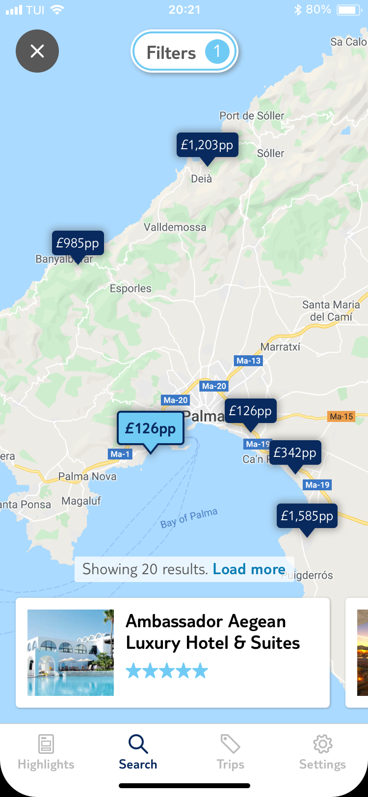
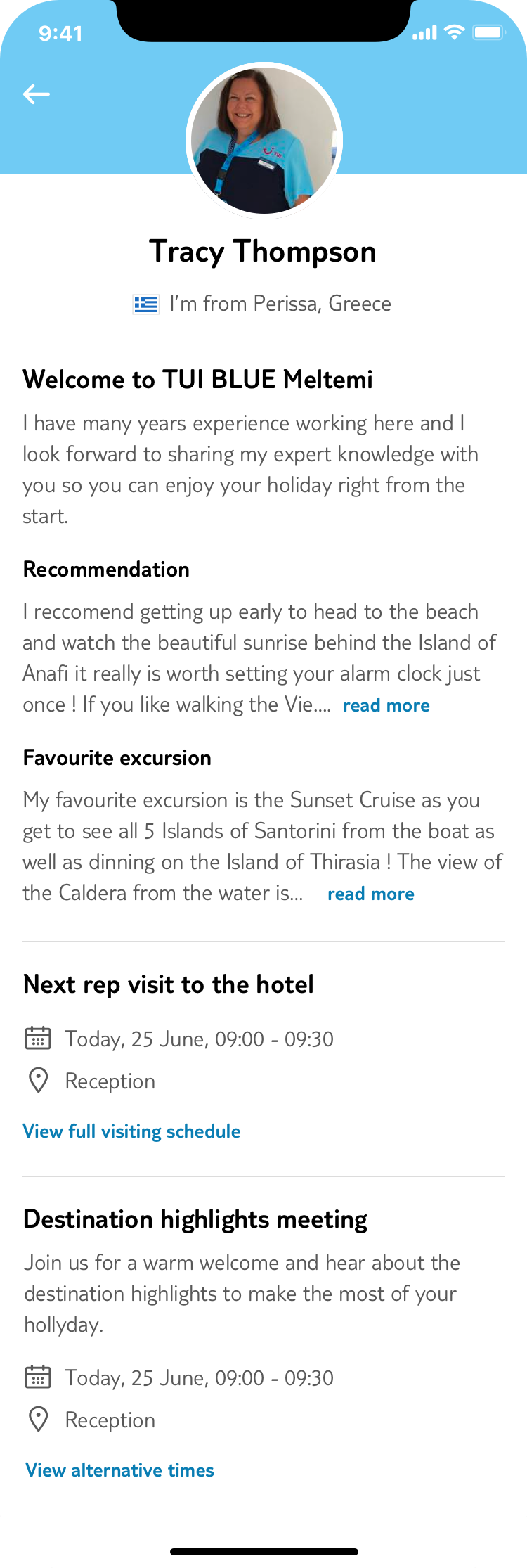
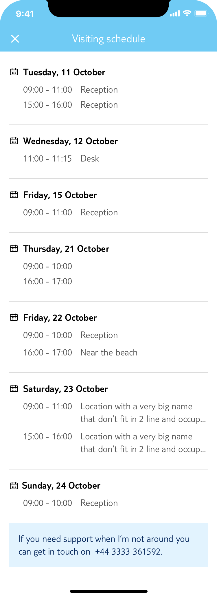
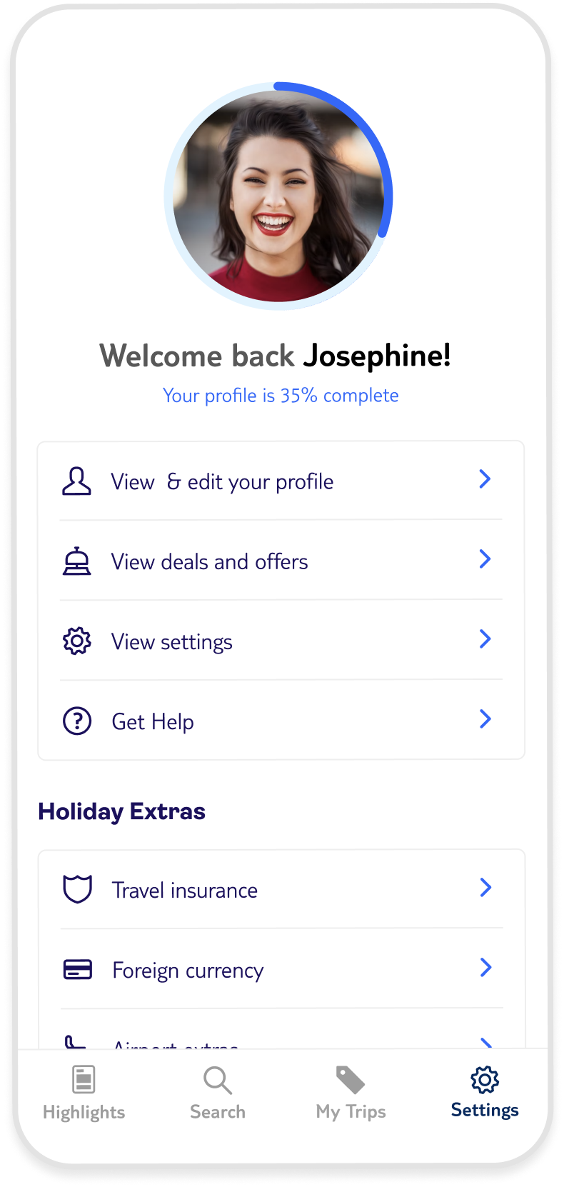
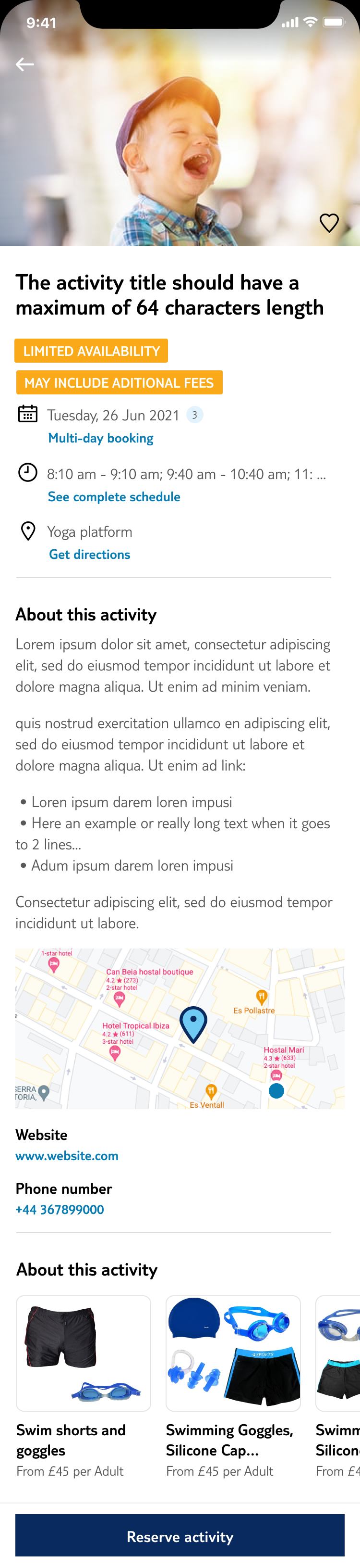
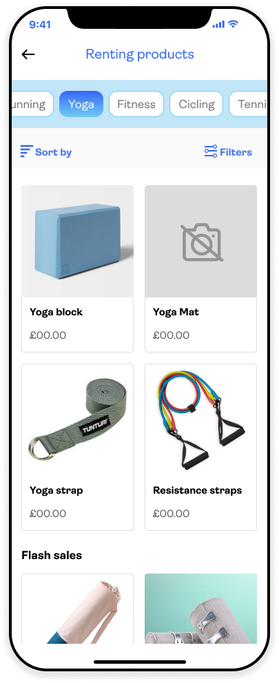
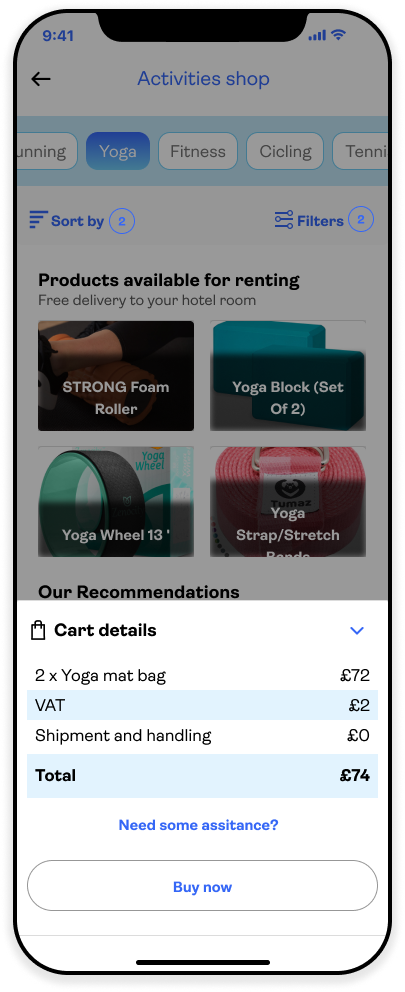
A selection of projects, explorations, and UI improvements from my time at TUI — spanning booking flows, internal tools, illustration systems, and product concepts.
The existing accommodation experience presented hotels and room types in a way that was difficult to compare — inconsistent card layouts, limited filtering, and a room-selection step that felt disconnected from the rest of the booking journey. The overhaul focused on three things: surfacing the right information at the right moment, making comparison intuitive, and reducing the cognitive load at the point of commitment.
The hotel detail page was rebuilt to lead with the information that mattered most to bookers — board type, key amenities, and distance — before moving into room selection. Room cards were redesigned with a clearer hierarchy, making inclusions and upgrade options easier to scan. The booking summary was made persistent throughout, so users always knew what they were committing to.
Hotel listing — updated card layout
Hotel Facilities detail
Map with prices
The rep profile page served as the primary point of contact between guests and resort staff — yet its design hadn't kept pace with the rest of the app. The update brought it in line with the current design system while improving the clarity of the rep's availability, role, and contact options.
The changes were intentionally light-touch: improved typography hierarchy, a cleaner contact CTA layout, and a more considered use of the rep's photo — making the page feel more personal without adding complexity.
The account and settings screens were among the oldest in the app, and it showed. Inconsistent spacing, outdated list patterns, and a profile page that felt like an afterthought. The redesign standardised the component usage across both screens, introduced a cleaner profile header, and restructured the settings list for better logical grouping.
The goal was consistency and confidence — users managing their details or preferences should feel as cared-for as users actively browsing holidays.
User profile
User profile - Complete page
Error screens and empty states are easy to deprioritise — they're edge cases, rarely seen in demos. But they're often the moments users are most frustrated. The old approach relied on generic iconography with minimal context, giving users nothing to hold onto when something went wrong.
The new illustration set introduced a consistent character-driven style: warm, slightly playful, always on-brand. Each illustration was designed to match the specific error context — a lost connection looks different from an empty search result, which looks different from a payment failure. The tone is reassuring without being dismissive.
These illustrations were designed for versatility: a duotone palette offers a seamless, sophisticated match with the app’s core aesthetic, while the full-color set can be deployed to inject energy and 'life' into high-engagement touchpoints.
General empty state
Empty search results
Payment error
Caroussel updated version
The idea emerged from a recurring observation: guests would discover an activity they wanted to do, but hadn't packed the right kit — snorkels, hiking poles, beach towels. Rather than miss out or make an expensive purchase at the resort shop, the app could facilitate it directly, connected to the activity they'd already shown interest in.
The entry point was natural: the activity detail page already had strong intent signal. A contextual "What you'll need" section with a direct path to the shop felt low-friction and genuinely useful. The shop itself used a lightweight catalogue model — browse by activity type, rent for the duration of your stay, or buy to keep. Delivery to your room or collection at the activity point.
Activity detail entry point
Cart & delivery options
Order confirmation